Wednesday, 23 December 2009
Merry Christmas
Just a quick note to say that i hope you all have a good Christmas and New Year's break, cant quite believe that another year has flown by but am certainly looking forward to what 2010 will bring! Heres a little teaser of a recently completed piece for the spring show, see you next year!

Categories:
art,
illustration,
mostlywanted
Thursday, 3 December 2009
Beautiful Grim
A while ago i got a message from a friend on facebook that made me aware of a project being put together by concept artist Mike 'Daarken' Lim. Earlier this year his girlfriend, Cat, was diagnosed with breast cancer at the age of 25, after 16 weeks of chemotherapy she had a bilateral mastectomy.
In order to help with the ensuing medical bills he and some friends have set up a charity auction and are asking artists, sculptors and photographers to donate some work. The theme / title of 'Beautiful Grim' has been given to the event and artists from all around the globe are getting involved, at the moment theres about 200 participating, hopefully raising the much needed funds for both Cat and a Breast cancer charity.
Ive just finished my contribution, it a digital painting which on the final print will be hand embellished (so a total one of a kind), signed and framed. Heres a couple of shots of the artist proofs (theres a bit of a color cast on them in the photos which is throwing everything off slightly)


I will post more details about the show and auction as i get them but in the meantime make sure you pop by the site and join the facebook group, buy or donate if you can!
Beautiful Grim website.
-
Beautiful Grim Facebook group.
-
Mike 'Daarken' Lim.
In order to help with the ensuing medical bills he and some friends have set up a charity auction and are asking artists, sculptors and photographers to donate some work. The theme / title of 'Beautiful Grim' has been given to the event and artists from all around the globe are getting involved, at the moment theres about 200 participating, hopefully raising the much needed funds for both Cat and a Breast cancer charity.
Ive just finished my contribution, it a digital painting which on the final print will be hand embellished (so a total one of a kind), signed and framed. Heres a couple of shots of the artist proofs (theres a bit of a color cast on them in the photos which is throwing everything off slightly)
I will post more details about the show and auction as i get them but in the meantime make sure you pop by the site and join the facebook group, buy or donate if you can!
Beautiful Grim website.
-
Beautiful Grim Facebook group.
-
Mike 'Daarken' Lim.
Categories:
art,
illustration,
mostlywanted,
prints
Friday, 27 November 2009
IFAW ad campaign
I got asked to help produce the latest print ads for IFAW's (International Fund for Animal Welfare) Save the whales campaign. The whaling season started this month and the ads have gone to press. The campaign was produced for IFAW by JWT Melborne. Below is the concept as delivered from JWT, it was something that i was fully prepared to do in a full colour, painted manner but the feedback was that they wanted to keep it this simple- a little outside what i was expecting but i think the result works well.
The campaign was intending to stay away from the usual shock tactics and gore, hence the simplicity of the initial designs, as i began working on them they took on quite a ghostly appearance- something i pushed into the final design. The copy was intended to give the suggestion of running water, i havent received the final artwork with the right copy but apparently its not far off these.


In other news, im currently working on a new body of work with the view to having a show in the first part of next year. As a consequence things may go a little quiet here, bear with me and i will hopefully be able to give you some peaks at the works as they progress.
The campaign was intending to stay away from the usual shock tactics and gore, hence the simplicity of the initial designs, as i began working on them they took on quite a ghostly appearance- something i pushed into the final design. The copy was intended to give the suggestion of running water, i havent received the final artwork with the right copy but apparently its not far off these.
In other news, im currently working on a new body of work with the view to having a show in the first part of next year. As a consequence things may go a little quiet here, bear with me and i will hopefully be able to give you some peaks at the works as they progress.
Categories:
CIA,
design,
illustration
Wednesday, 11 November 2009
CIA 2010 calendar launched
Its that time of year again, the new CIA 'ACE' calendar for 2010 has been set free and is now available to purchase. Check out the CIA Shop for more information. Below is a couple of press shots and at the bottom is my image, hopefully it makes sense in the context of the calendar, if not- at least it should be odd enough to catch your eye!


Categories:
CIA,
design,
illustration,
mostlywanted
Tuesday, 20 October 2009
BBC Myths work live
The guys at Preloaded have done a nice job and my work for the BBC's Myths stories is now live. Check out the BBC Myths main site where you can view all the stories that are currently available and their associated mini games.
Make sure you hit the full screen option so you can see as much of the illustrations as possible, youll get the full image if your monitor is running at 1920px. The control panel allows you to move around in the story and turn the text or narration on and off. As well as the parallax scrolling, some lighting and other flash effects have been added. Check out the Guinevere's Wedding story direct and heres a look at some other reduced size pages.


Make sure you hit the full screen option so you can see as much of the illustrations as possible, youll get the full image if your monitor is running at 1920px. The control panel allows you to move around in the story and turn the text or narration on and off. As well as the parallax scrolling, some lighting and other flash effects have been added. Check out the Guinevere's Wedding story direct and heres a look at some other reduced size pages.
Categories:
CIA,
illustration,
mostlywanted
Monday, 19 October 2009
Sony eBook
Awhile back i got to work on a job for the new Sony reader eBook. You may have seen these things around, a digital 'book' that allows you to download and store the written word, much like an mp3 player.
The campaign takes 4 different takes on the eBook reader, i was lucky enough to get the fantasy version, while the brief was quite specific and i had to fit the illustration to the photograph i did have a good amount of freedom to add characters that i knew would work. Ive just noticed the campaign is now going live, or at least the products webpage is now showing the new line and the campaign, not sure about the print ads yet.
Heres the link to the eBooks product page, my work is in the main intro flash at the end. View the Sony reader eBook site.
The illustration not only needed to work with the photo-shoot but was required to be supplied with each character on separate layers, this was so that as well as being a print ad, it could be animated in flash, on the site you can see the results of the animation. Heres the final artwork on the working photograph (i think that in the final version the photograph was retouched a bit) and below are some detail shots.
Categories:
CIA,
illustration,
mostlywanted
Wednesday, 7 October 2009
CIA shop sale
To celebrate their birthday, the CIA shop is having a 25% off sale on a wide range of prints, my New Beginnings and Tiki Spirit pieces are included!
Check out the CIA shop sale.
Check out the CIA shop sale.
Categories:
art,
CIA,
illustration,
prints
Monday, 5 October 2009
Carbon Cradle
Ive just started a new blog, somewhere i can post up images and links to stuff i find interesting without getting caught up in writing too much. Pretty much all areas of design, illustration, fine art, craft- basically anything i like looking at- i can now pass on. Ive just finished tweaking the blogger template, hopefully it will grow from here.
Visit Carbon Cradle here.
Visit Carbon Cradle here.
Wednesday, 16 September 2009
BBC Myths from Preloaded
Ive just finished up doing the story illustrations for the forthcoming BBC Myths site which is currently under development by Preloaded. It will be a flash site where Arthurian based stories will be available, 4 to start off with but hopefully more will be added down the line. I was fortunate to be picked to illustrate one of the stories. There are 10 chapters so 10 screen illustrations and a mini game that will be included per story.
Each illustration was created on various layers so that the guys at Preloaded could take the files and, using some Flash Parallax Scrolling, give a sense of depth to the scene. Little animated touches will be added and the stories themselves will be narrated as well as having controls for page turns and type overlays, so each illustration also needed to include some dead space for when any type gets overlaid.
Below is a reduced size preview of chapter 6. At full screen each illustration covers a 1920px resolution. Im really looking forward to seeing what the guys come up with, i will post up a link when everything goes live. (This is also copyright to the BBC btw)

Im off for a little break but will be back soon, hopefully refreshed and ready to get some new work done.
Each illustration was created on various layers so that the guys at Preloaded could take the files and, using some Flash Parallax Scrolling, give a sense of depth to the scene. Little animated touches will be added and the stories themselves will be narrated as well as having controls for page turns and type overlays, so each illustration also needed to include some dead space for when any type gets overlaid.
Below is a reduced size preview of chapter 6. At full screen each illustration covers a 1920px resolution. Im really looking forward to seeing what the guys come up with, i will post up a link when everything goes live. (This is also copyright to the BBC btw)

Im off for a little break but will be back soon, hopefully refreshed and ready to get some new work done.
Edwin Ushiro at LeBasse
Arrested Motion have posted some rather nice pics of Edwin Ushiros solo show "Softly Encompassing the Womb." This is a body of work that was inspired by ghost stories he heard growing up in Hawaii and he seems to have included some of those stories with the relevant artwork on display. Its great when artists are able to give the viewer a back story, Travis Louie is a fantastic example. Check out the show pics at Arrested Motion here.


Saturday, 5 September 2009
Fine Grime
I now have 2 prints available as limited editions through the great Fine Grime, Sweet Mercy and Reliquary.

Im currently up to my ears with a job for the BBC via the nice guys at Preloaded, cant show anything about it at the moment- hopefully i will post some shots of the illustrations when the site is finished, really looking forward to how it turns out although i have to say after this job is finished i may never want to paint a forest piece ever again.
I have a bunch of new work in the pipeline that i cant wait to get started on, it will have to wait a little while (after i finish this current job) as ive had the joy of developing RSI in my hand, consequently using a mouse and tablet have both become pretty painful, so a bit of R&R is long overdue!
Categories:
art,
mostlywanted,
prints
Tuesday, 4 August 2009
Reliquary
Just finished this piece 'Reliquary' which will hopefully be doing the rounds in the forthcoming Central Illustration 'Traveling Circus' show. It will soon be available through Fine Grime who will be releasing it along with Sweet Mercy as limited edition prints. More details to come.


Categories:
art,
CIA,
illustration,
mostlywanted,
prints
Kokeshi Show
For awhile now ive been seeing various artists showing or mentioning about having a piece shown in a forthcoming Kokeshi Show at the Japanese American National Museum and it seems like its finally here. Arrested Motion posted an entry regarding the show 'Kokeshi: From Folk Art to Art Toy' and have posted a series of fantastic photographs from the exhibition. You can view the museums complete selection of dolls here, some of which are still available to buy. Kokeshi: From Folk Art to Art Toy
Heres a few of my favorites but make sure you check out the Arrested motion post and the Museums pages for other great works.

Heres a few of my favorites but make sure you check out the Arrested motion post and the Museums pages for other great works.

Tuesday, 21 July 2009
Crazy 4 Cult 3D show
Photos are up of the works in the Crazy 4 Cult 3D show at Gallery1988. Some amazing works on display, covering a good range of cult classics, although it looks like Willy Wonka gets some pretty good coverage. Check out the Gallery1988 blog to see all the photos, here are some of my personal favorites:

01: Audrey Pongracz "Gooses Geeses" / Charlie and the chocolate factory
02: Dan May "Portrait Of A Gentle Man" / Edward Scissorhands
03: Krista Huot "Temptresses" / Monty Pythons Holy Grail
04: Dave MacDowell "Appetite For Veruca" / Charlie and the chocolate factory
05: Ana Bagayan "Silence" / Silence of the lambs
06: Charlie Immer "Re-Animated" / Re-animator
07: Shannon Bonatakis "Little Violet Beauregarde" / Charlie and the chocolate factory
08: Lola "Portrait Of Veruca Salt" / Charlie and the chocolate factory
09: N.C. Winters "I Am Jack's Broken Heart" / Fight club
These are all crops so make sure you visit the show page to see the images in the complete form- Ana's Silence of the lambs tribute is just awesome.
Categories:
art
Monday, 6 July 2009
The Forbidden Sea
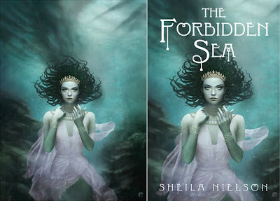
Here is my promised walk-through on the creation of the cover artwork for The Forbidden Sea by Sheila Nielson for Scholastic Books. Its the most in-depth one ive done so- be prepared. The initial synopsis for the book gave me some background info on the story and detailed character descriptions.
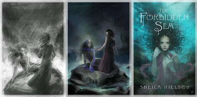
The initial sketches were very much based in the narrative, trying to stick to the information i was given as closely as possible but it just wasnt working. So the initial composition was ditched in favor of a more portrait style cover- something im far happier with and after a few variations a suitable sketch was given the green light. Below are the primary first steps. From the left, the speed paint to give an idea of composition, the color reworked version after some feedback and finally a more worked up portrait sketch. As you can tell, these are very quick and arent concentrating on anything more than composition color and mood, the final sketch had more work done on the face to try and convey the focal point of the face and the eyes which are golden in the book description.
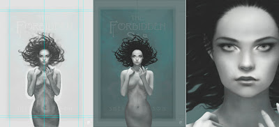
The first steps were to create a working document, the working file is larger than the final deliverable document but both have the same areas. The actual cover dimensions, bleed and then enough room for any additional wrapping that may be needed at a later date. Once the master working file is setup with guides and a base layer of the sketch stretched up and a top layer of the supplied cover typography (in black and white and set to screen mode so only the type shows through) i can get on with the painting.
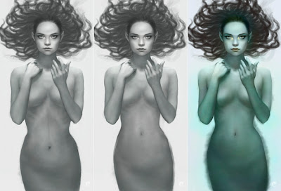
From left to right (and on all other subsequent images), the pencil sketch is set on a top layer on multiply, painting can then be done on layers below to generate form. The first stage is roughly blocked in with a hard edged brush in photoshop, refining the form and lighting in black and white at this point. Im working in bw because the final skin will be primarily made up of greens and blues which can be added on top. The next panel shows the photoshop base sketch after it has been flattened, taken into painter, blended, then painted using digital oils. The result is then opened back in photoshop where the mermaid is separated from the background using a combination of clipping path and mask. In panels 2 and 3 you can also see that i have refined the hair.
In the description of the mermaid, her hair sounds like it should have been dreads, certainly rope like and intertwined with braids of various hues of green, with a golden bead at the end. Unfortunately this just didnt feel right for the image. Dreads just dont move very well underwater so i took some artistic license and gave her hair a more 'sea anemone' feel that would flow and give her some movement.
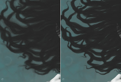
The basic shapes were roughly brushed in and then a layer mask was added and then painted back. I tend to do this a lot, its non destructive and allows me to remove and refine strands of hair as need be and also create additional layers above that can be added as clipping masks, effecting only the base shape. Depth, color, adjustments etc all only effecting the bottom shape layer. Heres the hair before and after the masking is done.
The figure gets a rough scale pattern added, just experimenting at this stage and the background is worked up with a variety of custom brushes. Its a good thing to check on whats happened so far so the guides are displayed and the type is turned back on. This thows up some problems with the mermaid that are addressed shortly. In the 3rd panel the reworked mermaid is added and more work is done on the background.
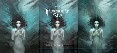
In the previous steps i spoke about the issues i had with the mermaid. This shows what was done. As you can see in the first panel, the bottom half of her looked a little odd. Fortunately as she is separate from everything else it was simple enough to go back and make the alterations. Panel 2 shows the remodeling in progress. Once i was happier with the shape i was able to start adding color via separate layers set to color mode in PS. Once the majority of the tints were done i jumped back to painter and continued to refine the figure but this time using full color oils.
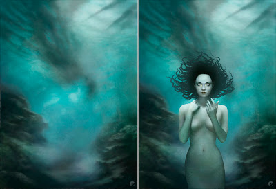
Once the mermaid was more finalized i could move to the background. The rough underwater landscape was flattened down and taken into painter and worked up, i had kept a flat guide layer in the file that was a low opacity version of the mermaid, hair and type, helpful for deciding on more detailed lighting and color choices. Once completed, its back to PS. The mermaids hair gets a little light airbrushing on a clipping layer to co-ordinate with the background and texture gets added to the mermaids skin.
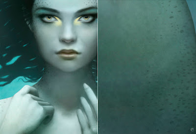
I had always envisioned her with scales, not just the assumed tail / pelvis area but also subtly over her whole body. So after a lot of searching i found some stock fish scale textures and managed to get her looking suitably fishy. While looking around at a lot of fish it became clear that she really needed some other patterning to help bring her to life.
Onto the hair. As i mentioned before, the hair base is just one flat layer with a mask so add the following effects are just built up on top as clipping masks. 01: the ends of the hair lightened to tonally match the sea and the focal area really darkened down. 02: more definition is given to the strands and the first steps of the lighting are added. 03: the braids are further developed and finally blurred with highlights added on a softlight layer.

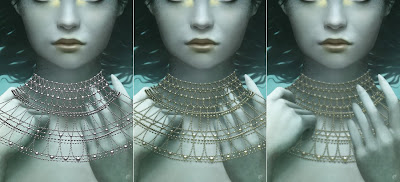
In the description the mermaid wears a crown and a gold bead necklace over her neck and shoulders like a fine dew laden spiderweb. I had sketched this in the early stages and as i went along decided that she also needed some bracelets to help break up the expanse of her forearms. The jewelry was all done in a very similar way, i flattened everything down, saved it out as a jpg and used this as a placer in illustrator. Multiple beads were created in bw with a simple radial gradient and laid out in the desired shapes. Once i was happy with my vector artwork it was pasted into ps and the layer duplicated and treated with hue / saturation adjustments, blurred, and masked.
Again, the technique i use for creating the dress is something ive done many a time so its something i can do quicker than try to explain, but here goes.
On a new layer i sketch out the shape i want for the material, once thats ok i create a series of paths that i can use later as selections and use them to create a simple fill layer of my base color. With all the paths active i make a selection, hide the fill layer and copy all thats visible to the clipboard. With the selection still active i create a new channel, paste into the selection and then start painting the folds in bw.
After blurring, some dodge and burn and refinement i end up with a clean channel as per panel 2. I can then make a selection from this to add a mask to the vector fill layer giving me the basic transparency of the material and then using the same selection add fill layers to that base shape as clipping masks. Its just a case of shifting levels and some gentle airbrushing to add highlights etc in various colors. All of which- being fill adjustment layers can be easily fine tuned as needed.
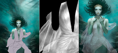
Bubbles and overlying textures are added as final touches. The bubbles are a combination of custom brushes on multiple layers, all set to screen and masked to help give more depth. On the right is the final submitted version.
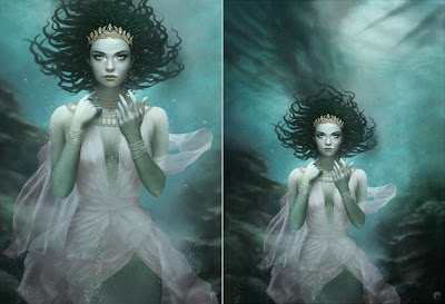
After the initial good feedback some issues were raised that required some additional alterations. First the shadows and highlights that gave definition to her breasts needed to be reworked to flatten her chest somewhat, then more color was added to the material. Finally it was decided that her dress was too revealing and i needed to go back and rework it to hide more of her exposed chest. Fortunately that was it. Here is the finished painting and on the right the cropped version with the type placer overlay. I believe the type will be gold foil and embossed to tie in with the jewelry but that could be subject to change.
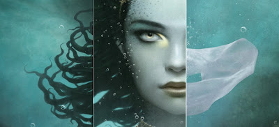
Once the painting is finished at its working size it is a simple case of transferring a flattened version to the deliverable size document and checking to make sure colors are in gamut etc. Heres a few detail shots to sign off!
The initial sketches were very much based in the narrative, trying to stick to the information i was given as closely as possible but it just wasnt working. So the initial composition was ditched in favor of a more portrait style cover- something im far happier with and after a few variations a suitable sketch was given the green light. Below are the primary first steps. From the left, the speed paint to give an idea of composition, the color reworked version after some feedback and finally a more worked up portrait sketch. As you can tell, these are very quick and arent concentrating on anything more than composition color and mood, the final sketch had more work done on the face to try and convey the focal point of the face and the eyes which are golden in the book description.

The first steps were to create a working document, the working file is larger than the final deliverable document but both have the same areas. The actual cover dimensions, bleed and then enough room for any additional wrapping that may be needed at a later date. Once the master working file is setup with guides and a base layer of the sketch stretched up and a top layer of the supplied cover typography (in black and white and set to screen mode so only the type shows through) i can get on with the painting.
From left to right (and on all other subsequent images), the pencil sketch is set on a top layer on multiply, painting can then be done on layers below to generate form. The first stage is roughly blocked in with a hard edged brush in photoshop, refining the form and lighting in black and white at this point. Im working in bw because the final skin will be primarily made up of greens and blues which can be added on top. The next panel shows the photoshop base sketch after it has been flattened, taken into painter, blended, then painted using digital oils. The result is then opened back in photoshop where the mermaid is separated from the background using a combination of clipping path and mask. In panels 2 and 3 you can also see that i have refined the hair.

In the description of the mermaid, her hair sounds like it should have been dreads, certainly rope like and intertwined with braids of various hues of green, with a golden bead at the end. Unfortunately this just didnt feel right for the image. Dreads just dont move very well underwater so i took some artistic license and gave her hair a more 'sea anemone' feel that would flow and give her some movement.
The basic shapes were roughly brushed in and then a layer mask was added and then painted back. I tend to do this a lot, its non destructive and allows me to remove and refine strands of hair as need be and also create additional layers above that can be added as clipping masks, effecting only the base shape. Depth, color, adjustments etc all only effecting the bottom shape layer. Heres the hair before and after the masking is done.

The figure gets a rough scale pattern added, just experimenting at this stage and the background is worked up with a variety of custom brushes. Its a good thing to check on whats happened so far so the guides are displayed and the type is turned back on. This thows up some problems with the mermaid that are addressed shortly. In the 3rd panel the reworked mermaid is added and more work is done on the background.

In the previous steps i spoke about the issues i had with the mermaid. This shows what was done. As you can see in the first panel, the bottom half of her looked a little odd. Fortunately as she is separate from everything else it was simple enough to go back and make the alterations. Panel 2 shows the remodeling in progress. Once i was happier with the shape i was able to start adding color via separate layers set to color mode in PS. Once the majority of the tints were done i jumped back to painter and continued to refine the figure but this time using full color oils.

Once the mermaid was more finalized i could move to the background. The rough underwater landscape was flattened down and taken into painter and worked up, i had kept a flat guide layer in the file that was a low opacity version of the mermaid, hair and type, helpful for deciding on more detailed lighting and color choices. Once completed, its back to PS. The mermaids hair gets a little light airbrushing on a clipping layer to co-ordinate with the background and texture gets added to the mermaids skin.

I had always envisioned her with scales, not just the assumed tail / pelvis area but also subtly over her whole body. So after a lot of searching i found some stock fish scale textures and managed to get her looking suitably fishy. While looking around at a lot of fish it became clear that she really needed some other patterning to help bring her to life.

Onto the hair. As i mentioned before, the hair base is just one flat layer with a mask so add the following effects are just built up on top as clipping masks. 01: the ends of the hair lightened to tonally match the sea and the focal area really darkened down. 02: more definition is given to the strands and the first steps of the lighting are added. 03: the braids are further developed and finally blurred with highlights added on a softlight layer.
In the description the mermaid wears a crown and a gold bead necklace over her neck and shoulders like a fine dew laden spiderweb. I had sketched this in the early stages and as i went along decided that she also needed some bracelets to help break up the expanse of her forearms. The jewelry was all done in a very similar way, i flattened everything down, saved it out as a jpg and used this as a placer in illustrator. Multiple beads were created in bw with a simple radial gradient and laid out in the desired shapes. Once i was happy with my vector artwork it was pasted into ps and the layer duplicated and treated with hue / saturation adjustments, blurred, and masked.

Again, the technique i use for creating the dress is something ive done many a time so its something i can do quicker than try to explain, but here goes.
On a new layer i sketch out the shape i want for the material, once thats ok i create a series of paths that i can use later as selections and use them to create a simple fill layer of my base color. With all the paths active i make a selection, hide the fill layer and copy all thats visible to the clipboard. With the selection still active i create a new channel, paste into the selection and then start painting the folds in bw.
After blurring, some dodge and burn and refinement i end up with a clean channel as per panel 2. I can then make a selection from this to add a mask to the vector fill layer giving me the basic transparency of the material and then using the same selection add fill layers to that base shape as clipping masks. Its just a case of shifting levels and some gentle airbrushing to add highlights etc in various colors. All of which- being fill adjustment layers can be easily fine tuned as needed.

Bubbles and overlying textures are added as final touches. The bubbles are a combination of custom brushes on multiple layers, all set to screen and masked to help give more depth. On the right is the final submitted version.

After the initial good feedback some issues were raised that required some additional alterations. First the shadows and highlights that gave definition to her breasts needed to be reworked to flatten her chest somewhat, then more color was added to the material. Finally it was decided that her dress was too revealing and i needed to go back and rework it to hide more of her exposed chest. Fortunately that was it. Here is the finished painting and on the right the cropped version with the type placer overlay. I believe the type will be gold foil and embossed to tie in with the jewelry but that could be subject to change.

Once the painting is finished at its working size it is a simple case of transferring a flattened version to the deliverable size document and checking to make sure colors are in gamut etc. Heres a few detail shots to sign off!

Categories:
CIA,
illustration,
mostlywanted,
process
Friday, 3 July 2009
More bits and pieces...
First off i just saw that the lovely Courtney Brims has a new flash site with some cool new work, if you havent already, go check out her work, the flash makes the site a little slow to actually view the full-size images- although it could just be my connection.. still great work anyway.

Secondly, Diskursdisko have a good interview up with Kevin Dart. Kevins work on his Yuki 7 project seems to be everywhere at the moment- and rightly so, its beautifully crafted and imagined. I have been a fan of his work for years, ever since i started seeing his retro posters start appearing in places like cgTalk and its a real pleasure to see the Yuki work gain momentum! Check out the interview with him here.

Im postponing my process piece about the book cover for Forbidden Sea, ive had another last minute alteration and until i get an official sign-off from the publishers i cant really do anything about posting any images up. Hopefully i will be able to sort it out next week.
Something i just wanted to share on a tech type note, recently my secondary monitor started packing in so i purchased a new tft, i run a dual screen setup so i have a 24" w/s for my working area and upgraded from an old 15" to a 22" w/s for palettes from apps like photoshop, painter, illustrator and the like and have room to have mail or anything else open i should need. Anyway, after adding the larger monitor and reorganizing my palettes etc i noticed a really bad lag while painting in photoshop. I would do a brush stroke and then the timer would appear for a second as if the CPU was stressed a bit just by the application of a few pixels. Not a major thing but irritating. So thinking it would likely be the graphic card drivers or the OS needing updates etc i did the usual updates and promptly killed my system.
Now i would think that if you got the latest drivers for your graphics card it wouldnt mean a near terminal problem for the machine but thats exactly what happened. So after wasting practically an entire day messing around un-installing driver, rebooting and traveling back in time i got the system stable again and cleaned up. After thinking that it may be the higher res of the new monitor killing the graphics card then finding that it probably wasnt the problem, i turned my attention to photoshop itself- after all, thats where my original problem started.
After more research and trying various possible fixes it turned out to be something so stupid i almost wept. With my new found screen real-estate i had opened the info palette (as well as a few others i dont usually have active), turns out that was the problem. Working on hires files which have quite a few layers, the info palettes live updates on x/y, color etc was basically killing the CPU. Close it off- no more irritating timer lag! Bear this in mind if you start noticing the same behavior from PS.

Secondly, Diskursdisko have a good interview up with Kevin Dart. Kevins work on his Yuki 7 project seems to be everywhere at the moment- and rightly so, its beautifully crafted and imagined. I have been a fan of his work for years, ever since i started seeing his retro posters start appearing in places like cgTalk and its a real pleasure to see the Yuki work gain momentum! Check out the interview with him here.

Im postponing my process piece about the book cover for Forbidden Sea, ive had another last minute alteration and until i get an official sign-off from the publishers i cant really do anything about posting any images up. Hopefully i will be able to sort it out next week.
Something i just wanted to share on a tech type note, recently my secondary monitor started packing in so i purchased a new tft, i run a dual screen setup so i have a 24" w/s for my working area and upgraded from an old 15" to a 22" w/s for palettes from apps like photoshop, painter, illustrator and the like and have room to have mail or anything else open i should need. Anyway, after adding the larger monitor and reorganizing my palettes etc i noticed a really bad lag while painting in photoshop. I would do a brush stroke and then the timer would appear for a second as if the CPU was stressed a bit just by the application of a few pixels. Not a major thing but irritating. So thinking it would likely be the graphic card drivers or the OS needing updates etc i did the usual updates and promptly killed my system.
Now i would think that if you got the latest drivers for your graphics card it wouldnt mean a near terminal problem for the machine but thats exactly what happened. So after wasting practically an entire day messing around un-installing driver, rebooting and traveling back in time i got the system stable again and cleaned up. After thinking that it may be the higher res of the new monitor killing the graphics card then finding that it probably wasnt the problem, i turned my attention to photoshop itself- after all, thats where my original problem started.
After more research and trying various possible fixes it turned out to be something so stupid i almost wept. With my new found screen real-estate i had opened the info palette (as well as a few others i dont usually have active), turns out that was the problem. Working on hires files which have quite a few layers, the info palettes live updates on x/y, color etc was basically killing the CPU. Close it off- no more irritating timer lag! Bear this in mind if you start noticing the same behavior from PS.
Categories:
art,
illustration
Friday, 26 June 2009
All work, work, work...
Ive been pretty slack on the posting for a while, this is in part due to my somewhat absent mindedness of late and the recent beavering away on a couple of jobs. With those two looking like theyre pretty much wrapped up i can get back to having a look around the old interweb and see what ive been missing out on.
So much awesome work is being generated at the moment, its quite hard to know what to look at first, Nate Frizzell has a couple of new pieces on show (or at least new to me) make sure you stop by his blog and check out what hes been up to.

Tessar Lo has added a few more pieces to his portfolio site, this one seems to be a favorite among quite a few fans but seems like no-one else has mentioned the 'barely there' face in the landscape, im sure its reminiscent of a dream that many have had.

I discovered Kristina Collantes work awhile back and have just seen her site update with these cool Microscopics pieces...

Fecal Face have a good interview and studio visit with sculptor/artist AJ Fosik who currently has a show running at the White Walls Gallery in SF. Check out the interview here.

I could carry on with posting interesting bits and bobs ive found but theres far better places for you to find this sort of stuff so i will leave it there!
With any luck i will be making a process post about the book cover ive just completed for Scholastic, a watery mermaid piece thats come out rather well after a somewhat shaky start. Heres a small preview, im off for some medication to combat a cold i seem to have picked up from my daughter and to start sketching up some characters for a new job.

So much awesome work is being generated at the moment, its quite hard to know what to look at first, Nate Frizzell has a couple of new pieces on show (or at least new to me) make sure you stop by his blog and check out what hes been up to.

Tessar Lo has added a few more pieces to his portfolio site, this one seems to be a favorite among quite a few fans but seems like no-one else has mentioned the 'barely there' face in the landscape, im sure its reminiscent of a dream that many have had.

I discovered Kristina Collantes work awhile back and have just seen her site update with these cool Microscopics pieces...

Fecal Face have a good interview and studio visit with sculptor/artist AJ Fosik who currently has a show running at the White Walls Gallery in SF. Check out the interview here.

I could carry on with posting interesting bits and bobs ive found but theres far better places for you to find this sort of stuff so i will leave it there!
With any luck i will be making a process post about the book cover ive just completed for Scholastic, a watery mermaid piece thats come out rather well after a somewhat shaky start. Heres a small preview, im off for some medication to combat a cold i seem to have picked up from my daughter and to start sketching up some characters for a new job.

Categories:
art,
illustration,
mostlywanted
Monday, 11 May 2009
Fledgling process
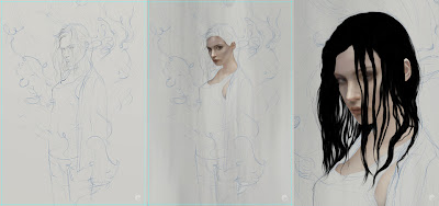
Finished up on this the other day and thought i would share a (somewhat longer) process post. First up heres the initial sketch drawn up in artrage on a neutral ground, this is drawn out at the same dimensions as the final artwork- (an a4 plus bleed document) once thats drawn out quite roughly in blue i neaten things up using a normal graphite color- namely the face as thats where the focus of the painting will be.
Still in artrage some texture gets blocked in using the oil textures and pallet knife. Then i can move over to painter and get the flesh painted in using the oil brushes and then its all photoshop from here on. Panel 3 shows the base shape of the hair painted in using a rough, almost fur or grass type brush.
This is painted on a few different layers and then merged together when im happy with the shape. A layer mask is added and using the same brush- but a lot finer, I paint in the mask to clean up the shape of the hair- it also allows you to create gaps in thicker strands to allow light through and also is non destructive to the original paint.
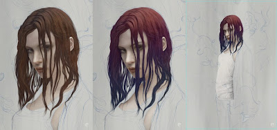
The next 2 panels show the detail being added, using a combination of brushes and the blur tool- layers are built up over the base hair layer as 'clipping masks', meaning that when you paint on each consecutive layer, paint is only visible where it overlays the base hair layer. Once the detail and form is done, final tweaks can be made- including a layer, set to color with reduced opacity where a tint of pink and blue is added.
The Third panel shows the vest started- a dark gray base shape layer is marked in using the pen tool then a solid white fill adjustment layer is created above and 'clipped' to the base shape. Then the folds are brushed in on the layer mask. This has the advantage of letting you adjust colors quite far down the process without too much hassle.
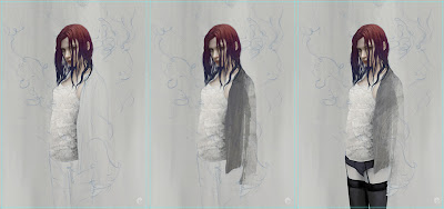
Further layers of texture and pattern are added to the vest stack using a variety of blending modes and opacities. The rest of the clothing is handled in a similar fashion, the jumper gets a basic shape drawn out with the pen tool which is saved and used as a group mask in which multiple layers of texture are added, each having their own masks which are in turn brushed using various textures. As the lower half of the body is only going to be partially viewable i dont worry about being too precise in creating her pelvis and thighs- painted in using a default hard edged brush does the job.
Once the clothing is done, each items group (eg the vest is one group of layers, the jumper is in another and finally the waist down) gets a mask and more texture is added, this is done in a couple of ways- texture brushes roughly painted in and also taken from texture photos. A pretty simple way of doing this is to find something with a suitable contrast, paste the image in on top of where you would like to add the texture. Once its there lower the opacity so you can align or scale it to your liking, reset the opacity to 100 and go to the channels tab, choose the best channel for the textures contrast and ctrl click the thumbnail. This loads the channel as a selection, hide the actual pasted texture layer, select your group mask and paint some black over the selection.
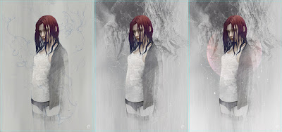
Next the background texture is created at the bottom of the layer stack, using some photo texture, brushes and masking. Back up at the top- the thread lines are simple paths drawn with the pen tool and 'stroked' with a default brush set with a pixel or two of blur and 'simulate pressure' checked. The resulting lines are slightly blurred and enhanced, grouped within a folder where yet another mask is made and areas brushed out and softened.
Finally in a separate top folder, additional texture, vector details, accent colors and touch-ups are made before a flattened version gets a small amount of noise added.
Final artwork and details.

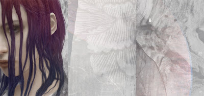
Still in artrage some texture gets blocked in using the oil textures and pallet knife. Then i can move over to painter and get the flesh painted in using the oil brushes and then its all photoshop from here on. Panel 3 shows the base shape of the hair painted in using a rough, almost fur or grass type brush.

This is painted on a few different layers and then merged together when im happy with the shape. A layer mask is added and using the same brush- but a lot finer, I paint in the mask to clean up the shape of the hair- it also allows you to create gaps in thicker strands to allow light through and also is non destructive to the original paint.

The next 2 panels show the detail being added, using a combination of brushes and the blur tool- layers are built up over the base hair layer as 'clipping masks', meaning that when you paint on each consecutive layer, paint is only visible where it overlays the base hair layer. Once the detail and form is done, final tweaks can be made- including a layer, set to color with reduced opacity where a tint of pink and blue is added.
The Third panel shows the vest started- a dark gray base shape layer is marked in using the pen tool then a solid white fill adjustment layer is created above and 'clipped' to the base shape. Then the folds are brushed in on the layer mask. This has the advantage of letting you adjust colors quite far down the process without too much hassle.

Further layers of texture and pattern are added to the vest stack using a variety of blending modes and opacities. The rest of the clothing is handled in a similar fashion, the jumper gets a basic shape drawn out with the pen tool which is saved and used as a group mask in which multiple layers of texture are added, each having their own masks which are in turn brushed using various textures. As the lower half of the body is only going to be partially viewable i dont worry about being too precise in creating her pelvis and thighs- painted in using a default hard edged brush does the job.
Once the clothing is done, each items group (eg the vest is one group of layers, the jumper is in another and finally the waist down) gets a mask and more texture is added, this is done in a couple of ways- texture brushes roughly painted in and also taken from texture photos. A pretty simple way of doing this is to find something with a suitable contrast, paste the image in on top of where you would like to add the texture. Once its there lower the opacity so you can align or scale it to your liking, reset the opacity to 100 and go to the channels tab, choose the best channel for the textures contrast and ctrl click the thumbnail. This loads the channel as a selection, hide the actual pasted texture layer, select your group mask and paint some black over the selection.

Next the background texture is created at the bottom of the layer stack, using some photo texture, brushes and masking. Back up at the top- the thread lines are simple paths drawn with the pen tool and 'stroked' with a default brush set with a pixel or two of blur and 'simulate pressure' checked. The resulting lines are slightly blurred and enhanced, grouped within a folder where yet another mask is made and areas brushed out and softened.
Finally in a separate top folder, additional texture, vector details, accent colors and touch-ups are made before a flattened version gets a small amount of noise added.
Final artwork and details.

Categories:
fashion,
illustration,
mostlywanted,
process
Friday, 1 May 2009
Portrait drawing test
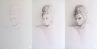
Recently i decided it would be a good idea to put pencil to paper- just so i remember what the hell it feels like. Unfortunately, working digitally its all too easy to forget how to draw / paint, not having 'undo' and the myriad of tools available in applications like painter and photoshop can actually be a daunting prospect. So here is the result- i took a few process shots on my phone so forgive how bad they look- the final drawing was scanned in, hence the better quality. Quite happy how it turned out and can now get back to my wacom with a slight sense of relief that i hadnt forgotten everything.


Categories:
art,
mostlywanted,
process
Subscribe to:
Comments (Atom)
