Friday, 27 January 2012

Catching up...

Cant quite believe its almost been a month since my last post! Ive been pretty bad at keeping up with stuff online for awhile- moving house and settling in took more of my time than i anticipated and its meant ive fallen behind on my work for a mini show with Corey Helford in March! As a little taster, heres a couple of wip IG shots of what to expect in March, when things get a little closer to the show i will be able to post up the full pieces!


Thursday, 8 September 2011

3Cs project, one week in...

Ive just updated the 3Cs project blog with a little post, its now 1 week to the day that i took the ref images and started the project and so far its been going well. Ive added a couple of photos of a portrait i did on wednesday so people have some idea of what im actually doing!

Have a look at the 3Cs blog: 100portraits.blogspot.com

Friday, 19 August 2011

Instagram pics...

As you may be aware, i use an iphone app called Instagram to take a lot of quick photos. At the moment (as far as im aware) there is no native website that allows people who dont have the app to view someones pictures. Of course you can see them if it gets posted through to Facebook, Twitter etc but not have a way to view everything that someone has taken. Fortuntely theres a site called Instagrid that allows you to view publish all you images under your profile and allow non Instagram users to see what youve been posting. Heres the link to my profile if you ever fancy a look:

http://instagrid.me/tombagshaw

Monday, 8 August 2011

3Cs Project Launched...

On the 1st of September i will start a project to create 100 portrait studies in 100 hours over 100 days! The idea is quite simple, take some reference photographs of 100 volunteers at noon on the 1st of September, then start creating a digital portrait study from the reference but only allow myself one hour to do it- one a day, for 100 days! Im hoping that this will allow me to further develop my portrait painting skills and will certainly make me do portraits that i would not normally undertake in my normal work!

I have set up a blogspot address, 100portraits.blogspot.com where you can find more information about the project if you would like to take part. Im also going to be promoting the project through Facebook and Twitter, if you can, please help in getting the word around, link to the blog, tell your friends etc. Obviously this is only going to be something you can volunteer for if youre in the Bath area on the 1st of September but i really need as much publicity as i can get in order for this to work!

Monday, 4 July 2011

CHG Teaser collection...

After 2 months, ive now come to the end of producing my work for the upcoming joint show with David Stoupakis at Corey Helford Gallery next month.

If you follow me on Instagram you will have seen these already- in fact you may have seen them on Facebook and Twitter as well (i upload to IG and sometimes send the feed to FB / Twitter too). These are the small teasers for the new show works, small closeups, sketches and works in progress, all taken with the Instagram app on Iphone4. I just wanted to collect them all in one place, hopefully it will show my progress over the last 8 weeks! Im now in the middle of printing, mounting, varnishing and framing.. then everything will be shipped over for the show!


Thursday, 21 April 2011

The Enchanted Forest...

'The enchanted forest' is a forthcoming show at the Strychnin Gallery in Berlin that i was asked to participate in. Heres the press release:

--

Every single minute forest regions with the size of 36 football fields disappear from our planet. Such a massive removal of trees without sufficient reforestation results in biodiversity loss, habitat damage and aridity. Deforested regions typically incur significant adverse soil erosion and frequently degrade into wasteland. Nowadays, deforestation accounts for about 20 percent of the global greenhouse gas emission which drastically affects global warming and climate change.

In concordance with the United Nation's International Year of Forests, Strychnin Gallery presents 'The Enchanted Forest' an international charity group show curated by Yasha Young and Giovanni Cervi that is dedicated to the forests and their inhabitants all over the world. The show should remind people of the drastic damage that is constantly done to our forests as well as their beauty, uniqueness and importance. Many lovingly and elaborately crafted sculptures as well as paintings and photographs by over 30 international artists will display both the desolation of deforestation and the forest‘s magic and liveliness that we have to save.

The long list of participating artists includes: David Hochbaum, Luke Chueh, Mia Araujo, Caitlin Hackett, Travis Lampe, Tom Bagshaw, Bethany Marchman, Mimi S., Seymour, Lindsey Carr, Skeleton Heart, Daniel van Nes, Christina Graf, Miraschi, Raf Veulemans, Lisa Black, Lisa Mei Ling Fong, Annie Bertram, Francois Escalmel, Wee Flowers, Squp, Tamara Ferioli, Fernanda Veron, Lost Fish, Angela Singer, Elmer Presslee, Lucy McLauchlan, Auriea Harvey & Michael Samyn (Tale of Tales), Sage Vaughn, Suzanne Moxhay, Yumiko Kayumawa and many more.

10 percent of the price of every sold artwork will be donated to a project of the WWF!

--

Of course i was more than happy to be involved and had a pretty strong idea of what i wanted to do almost immediately. Heres the final artwork and a little walk-through on the process behind it.


Quite unusually for me, i started out with a pencil sketch, yes- real paper and pencil! I didnt need a brilliant reproduction of the sketch as i was just going to be painting over the top so i just took a quick snap with my phone...


The next 3 shots are the quick greyscale forest painted in Photoshop over the top of the sketch, next up is a rough placement for the characters in the scene. Once i had these elements established i put a solid layer over everything and lowered the opacity slightly, then started sketching in the characters in more detail with a default round brush...


Once i had the sketch completed and given the characters some basic tonal work i did a few rough color tests then took a flattened high resolution file into Painter and began the long process of painting!


The final painting is 640x450mm minus frame (approx 25x18"), mounted, varnished and framed. The show runs from May 13th, for purchase enquiries please contact the gallery.

Wednesday, 13 April 2011

Imagine FX 69...

The latest issue of the fantasy and sci-fi digital art mag Imagine FX is now on sale and in this issue theres some great articles on painting fantasy landscapes along with the usual tips and tricks from some great artists. I was asked to the artist Q&A section with some advice on creating wavy / natural hair and also giving a character ghostly translucency. Im pretty bad at expressing myself through writing (which you can probably tell if youve spent any time on this blog) so hopefully the tips are reasonably easy to understand! Heres a few quick shots of the mag, if you see it on the stands make sure you check it out.


Saturday, 9 April 2011

Kate Middleton...

I was recently approached by the guys at the Daily Telegraph Magazine with the possibility of doing a portrait of Kate Middleton for an upcoming feature. Everything was a little shaky as it needed to not only get approval from the nice chaps at the magazine but also by the big guys on the Telegraph itself, as this was the first attempt at having an illustrated cover (and to my mind- also of impending royalty) i wasnt holding out much hope that it would get in.

I really had no brief, just to produce a good likeness / portrait of Kate and to bear in mind the usual constraints of editorial work- room for copy!


My first piece came out really well (i thought), i wanted to try and get her hair up off her shoulders- shes always photographed with her hair down and i wanted to move away from any preconceived views. Although (minus a couple of small edits) this was sounding pretty good- when it came to the big meeting the fact her hair wasnt down- was actually a problem and she needed to be more identifiable! So back in with long hair! Fortunately the rest of the image was good so i was able to salvage the facial portrait and edit everything else. When i got a quick mockup of the cover it became evident that it needed something else in the background, a right to left diagonal which darkened the top left for the type to appear as knockout fitted the bill nicely!

Many thanks to Gary Cochran at the Telegraph for commissioning this piece via CIA and for pushing to get an illustration onto the cover of the Telegraph Magazine, with any luck this will get some good feedback and allow a few more through!

Heres the final portrait, closeup details and a quick shot of the cover (she got scaled up a bit on the cover!)


Thursday, 23 September 2010

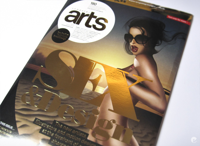
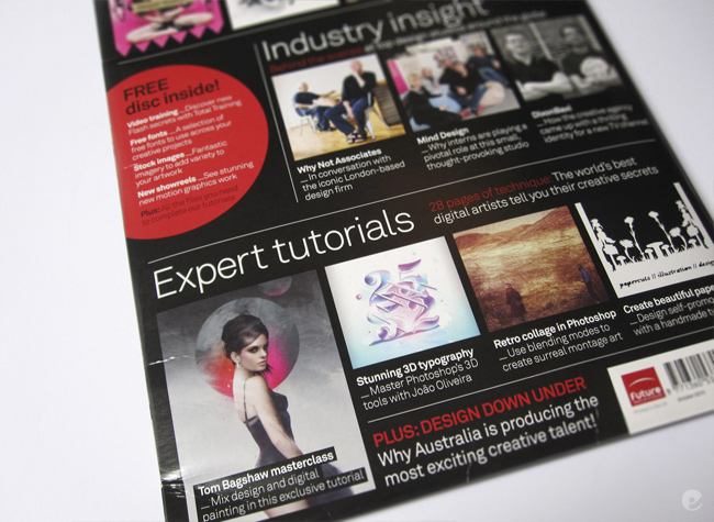
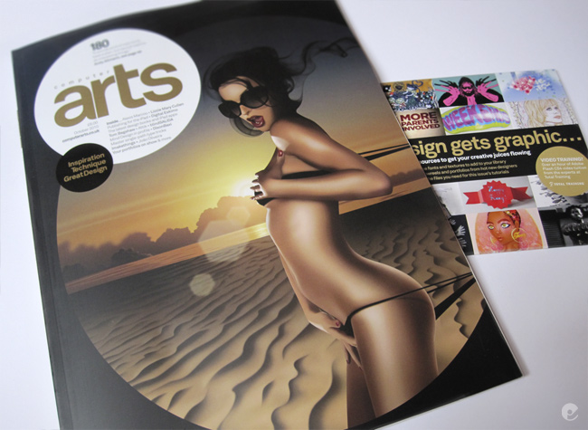
CA 180, The Sex Issue

Computer Arts magazine Issue 180 is now on the UK stands and as you may gathered from the title here- its the Sex Issue. To quote a little from the release copy:

'Whatever your opinion of it, sexual imagery within design is rife, and will almost certainly always be a part of the industry. So, this month we investigate, through a series of features, what is so alluring about erotically-charged design.'

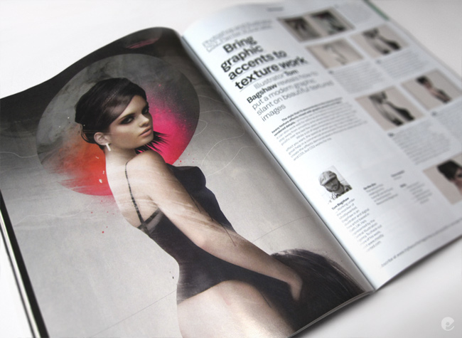
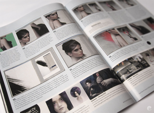
Ive done a new image and walk-through on its process for the issue so heres a few photos of the spreads. I have to say that im really looking forward to giving this one a read- from the quick look ive given it so far it looks like a great issue with some top notch content from a great array of contributors. Check out the images below and then get out and grab yourself a copy while you can!


Mailout sketch

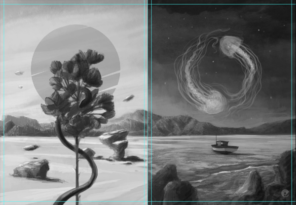
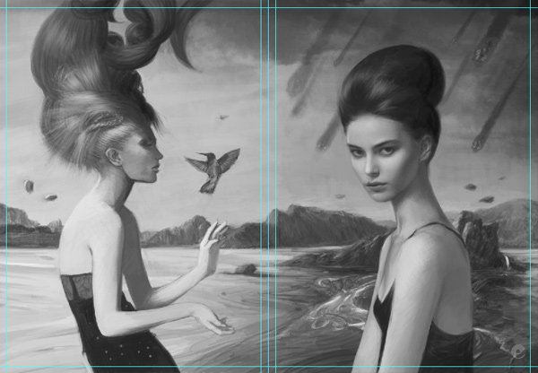
Mentioned this awhile back, im doing a mailout relatively soon- i decided to go with a nice postcard accordian fold. Taken me awhile to get around to actually working out what sort of thing i wanted to do. Finally finished a reasonable grayscale sketch, a few things are off a bit and the graphic elements are all missing, (i tend to work those details out as i go along) but its pretty much there i think. Will be cracking on with the high res version asap.

As you can see from the previews, its a large landscape piece that broken down into the panels reflects the 4 elements. When its folded you should also get Earth and Water to make a smaller landscape of their own. Looking forward to working out the details!


Thursday, 16 September 2010

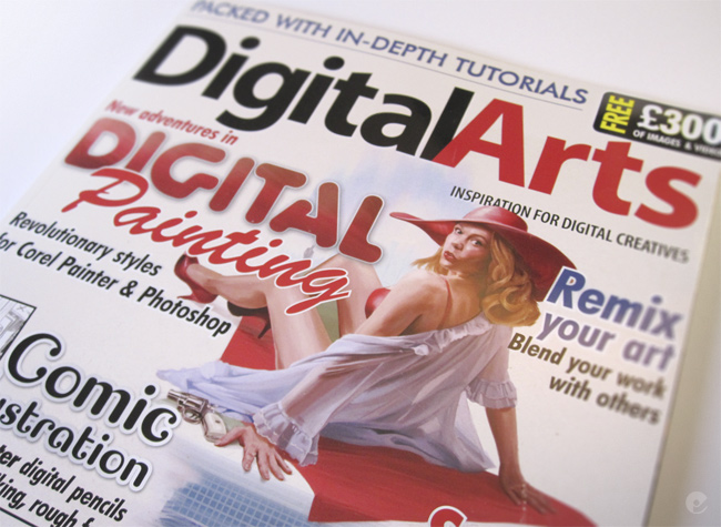
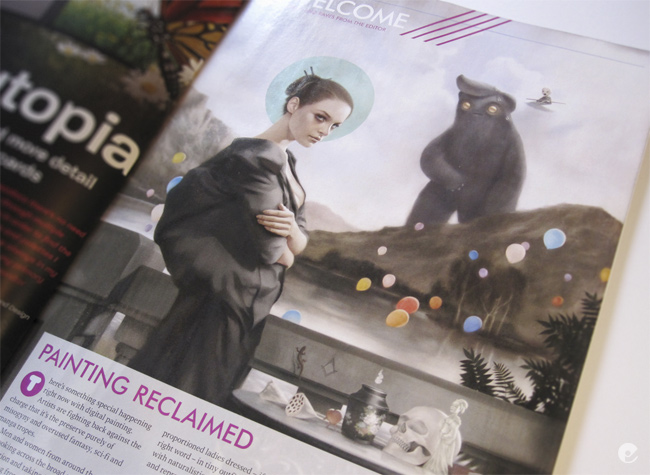
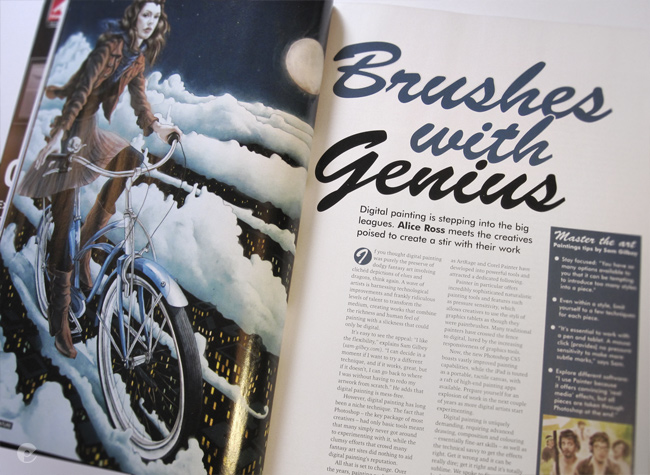
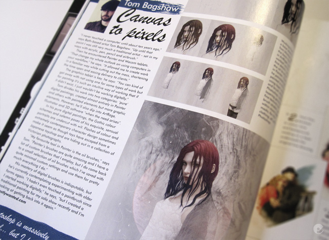
Digital Arts

The nice guys at Digital Arts magazine asked me to do a little interview and supply a few images for a feature in the Autumn issue. The Brushes with Genius article centers on the art of digital painting and gives interviews, tips etc from some great artists: Sam Gilbey, The Red Dress, Rory Kurtz, Marta Dahlig, and Meisan Mui.

The issue is on the stands now, pick up a copy if you can and heres some of my shots from the mag:


Tuesday, 17 August 2010

Computer Arts tutorial

Ive just finished an illustration and tutorial walk-though for the nice chaps at Computer Arts magazine. Issue 180 has a sexy theme and i was asked to produce something as a full page illustration together with a step by step breakdown of the process. Im pretty happy with the end result but as the issue isnt out yet i will just give you a little preview and give you a better view of the article when it hits the shelves.

Monday, 1 March 2010

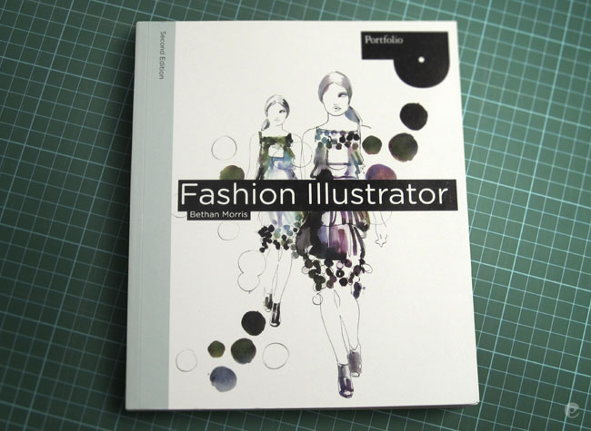
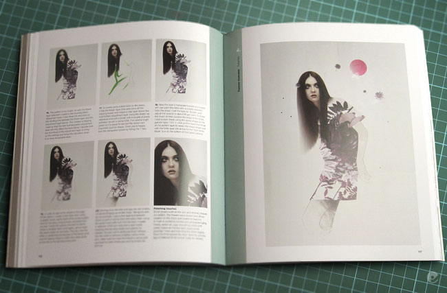
Fashion Illustrator 2 book

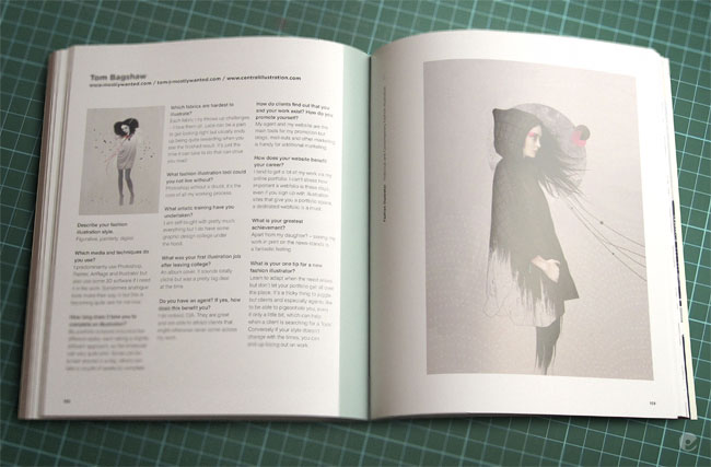
Finally got my copy of Fashion Illustrator- Second edition (ISBN-10: 1856696545). It seems like ive been waiting for this to come out for ages now, publishing times being what they usually are. Its a nice book- with a pretty good spectrum of artists interviewed, showcases and tutorials and is aimed at the fashion illustration student. Its similar to the first edition but definitely has more to offer.

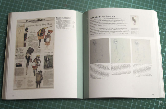
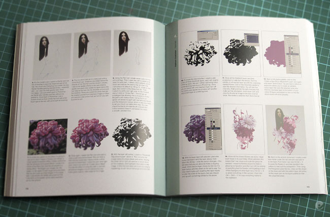
I have a few pieces throughout the book including an interview spread and a pretty in depth photoshop tutorial on how i created the Duck and cover piece (blogged earlier) which now i re-read it, is probably utterly confusing to just about everyone. When youre working on something, some ways you do it come second nature youve done them so many times but at the end of the day theyre a variety of simpler and quicker routes to accomplish the same result. So apologies if you buy the book, read the tutorial and then say 'wtf?!'.

Heres the photos of the book spreads. Go buy it and let me know what you think!


Monday, 6 July 2009

The Forbidden Sea

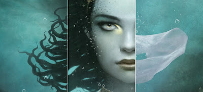
Here is my promised walk-through on the creation of the cover artwork for The Forbidden Sea by Sheila Nielson for Scholastic Books. Its the most in-depth one ive done so- be prepared. The initial synopsis for the book gave me some background info on the story and detailed character descriptions.

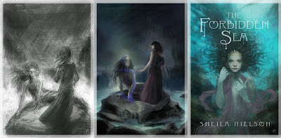
The initial sketches were very much based in the narrative, trying to stick to the information i was given as closely as possible but it just wasnt working. So the initial composition was ditched in favor of a more portrait style cover- something im far happier with and after a few variations a suitable sketch was given the green light. Below are the primary first steps. From the left, the speed paint to give an idea of composition, the color reworked version after some feedback and finally a more worked up portrait sketch. As you can tell, these are very quick and arent concentrating on anything more than composition color and mood, the final sketch had more work done on the face to try and convey the focal point of the face and the eyes which are golden in the book description.


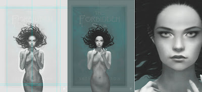
The first steps were to create a working document, the working file is larger than the final deliverable document but both have the same areas. The actual cover dimensions, bleed and then enough room for any additional wrapping that may be needed at a later date. Once the master working file is setup with guides and a base layer of the sketch stretched up and a top layer of the supplied cover typography (in black and white and set to screen mode so only the type shows through) i can get on with the painting.

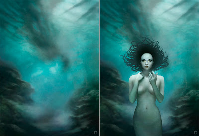
From left to right (and on all other subsequent images), the pencil sketch is set on a top layer on multiply, painting can then be done on layers below to generate form. The first stage is roughly blocked in with a hard edged brush in photoshop, refining the form and lighting in black and white at this point. Im working in bw because the final skin will be primarily made up of greens and blues which can be added on top. The next panel shows the photoshop base sketch after it has been flattened, taken into painter, blended, then painted using digital oils. The result is then opened back in photoshop where the mermaid is separated from the background using a combination of clipping path and mask. In panels 2 and 3 you can also see that i have refined the hair.


In the description of the mermaid, her hair sounds like it should have been dreads, certainly rope like and intertwined with braids of various hues of green, with a golden bead at the end. Unfortunately this just didnt feel right for the image. Dreads just dont move very well underwater so i took some artistic license and gave her hair a more 'sea anemone' feel that would flow and give her some movement.

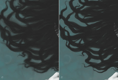
The basic shapes were roughly brushed in and then a layer mask was added and then painted back. I tend to do this a lot, its non destructive and allows me to remove and refine strands of hair as need be and also create additional layers above that can be added as clipping masks, effecting only the base shape. Depth, color, adjustments etc all only effecting the bottom shape layer. Heres the hair before and after the masking is done.


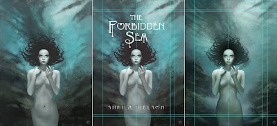
The figure gets a rough scale pattern added, just experimenting at this stage and the background is worked up with a variety of custom brushes. Its a good thing to check on whats happened so far so the guides are displayed and the type is turned back on. This thows up some problems with the mermaid that are addressed shortly. In the 3rd panel the reworked mermaid is added and more work is done on the background.


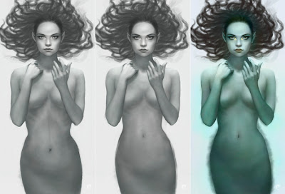
In the previous steps i spoke about the issues i had with the mermaid. This shows what was done. As you can see in the first panel, the bottom half of her looked a little odd. Fortunately as she is separate from everything else it was simple enough to go back and make the alterations. Panel 2 shows the remodeling in progress. Once i was happier with the shape i was able to start adding color via separate layers set to color mode in PS. Once the majority of the tints were done i jumped back to painter and continued to refine the figure but this time using full color oils.


Once the mermaid was more finalized i could move to the background. The rough underwater landscape was flattened down and taken into painter and worked up, i had kept a flat guide layer in the file that was a low opacity version of the mermaid, hair and type, helpful for deciding on more detailed lighting and color choices. Once completed, its back to PS. The mermaids hair gets a little light airbrushing on a clipping layer to co-ordinate with the background and texture gets added to the mermaids skin.


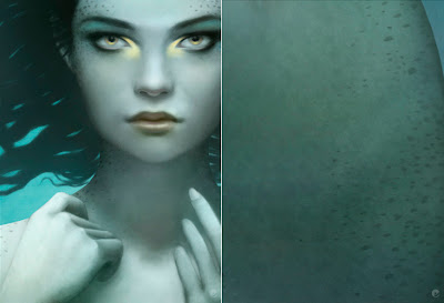
I had always envisioned her with scales, not just the assumed tail / pelvis area but also subtly over her whole body. So after a lot of searching i found some stock fish scale textures and managed to get her looking suitably fishy. While looking around at a lot of fish it became clear that she really needed some other patterning to help bring her to life.


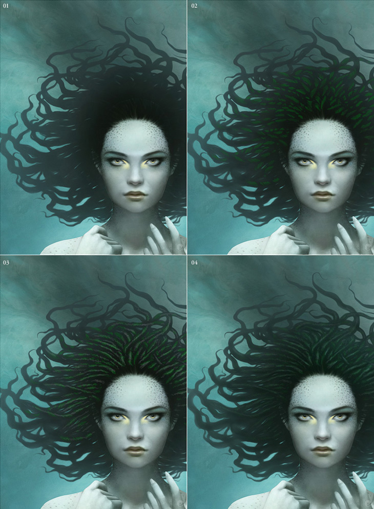
Onto the hair. As i mentioned before, the hair base is just one flat layer with a mask so add the following effects are just built up on top as clipping masks. 01: the ends of the hair lightened to tonally match the sea and the focal area really darkened down. 02: more definition is given to the strands and the first steps of the lighting are added. 03: the braids are further developed and finally blurred with highlights added on a softlight layer.


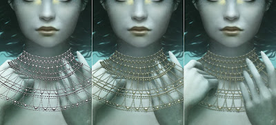
In the description the mermaid wears a crown and a gold bead necklace over her neck and shoulders like a fine dew laden spiderweb. I had sketched this in the early stages and as i went along decided that she also needed some bracelets to help break up the expanse of her forearms. The jewelry was all done in a very similar way, i flattened everything down, saved it out as a jpg and used this as a placer in illustrator. Multiple beads were created in bw with a simple radial gradient and laid out in the desired shapes. Once i was happy with my vector artwork it was pasted into ps and the layer duplicated and treated with hue / saturation adjustments, blurred, and masked.


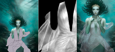
Again, the technique i use for creating the dress is something ive done many a time so its something i can do quicker than try to explain, but here goes.
On a new layer i sketch out the shape i want for the material, once thats ok i create a series of paths that i can use later as selections and use them to create a simple fill layer of my base color. With all the paths active i make a selection, hide the fill layer and copy all thats visible to the clipboard. With the selection still active i create a new channel, paste into the selection and then start painting the folds in bw.

After blurring, some dodge and burn and refinement i end up with a clean channel as per panel 2. I can then make a selection from this to add a mask to the vector fill layer giving me the basic transparency of the material and then using the same selection add fill layers to that base shape as clipping masks. Its just a case of shifting levels and some gentle airbrushing to add highlights etc in various colors. All of which- being fill adjustment layers can be easily fine tuned as needed.


Bubbles and overlying textures are added as final touches. The bubbles are a combination of custom brushes on multiple layers, all set to screen and masked to help give more depth. On the right is the final submitted version.
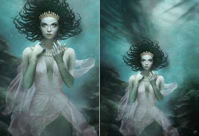


After the initial good feedback some issues were raised that required some additional alterations. First the shadows and highlights that gave definition to her breasts needed to be reworked to flatten her chest somewhat, then more color was added to the material. Finally it was decided that her dress was too revealing and i needed to go back and rework it to hide more of her exposed chest. Fortunately that was it. Here is the finished painting and on the right the cropped version with the type placer overlay. I believe the type will be gold foil and embossed to tie in with the jewelry but that could be subject to change.
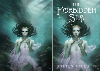


Once the painting is finished at its working size it is a simple case of transferring a flattened version to the deliverable size document and checking to make sure colors are in gamut etc. Heres a few detail shots to sign off!