Thursday, 6 October 2011

Best Small Shops...

Another illustration for the Daily Telegraph Magazine, this time a feature about the best small shops in Britain of 2011. The feature was not only about fashion but also categories such as best shop for wine, mens fashion, bookshop, interiors etc.. the brief was pretty open but the general idea was to have a sexy fashionista and incorporate the categories in there as well.

The idea to have her carry bags and have the categories on there seemed like a good one so i quickly sketched it up for approval. Even though her head is really the only part thats fully painted and its actually pretty small- it gave me a complete nightmare and took a couple of days to get 'right' (right to me that is) but everything else went pretty smoothly.


Tuesday, 13 September 2011

ST Fashion, Front Row...

After producing 2 illustrations for ST Fashion magazines AW/11 Guide to Coats feature, i also got asked to do a couple more for their Front Row feature in the same magazine. I think this issue is going to be out with the Daily Telegraph on the 18th Sept.


Monday, 1 August 2011

ST Fashion AW/11...

Heres a bit of new work recently commissioned for ST Fashion, a bi-annual published with the Daily Telegraph. They are for a 'Guide to coats' feature in the Autumn / Winter issue. A really nice job with a lot of supplied ref images and a pretty much free hand in what to produce. The first illustration is on a right hand page so the image leads your eye over the turn to the next page where the second image is boxed within a couple of columns. Really enjoyable job- thanks Ciara!


Wednesday, 16 March 2011

Daily Telegraph 70s Hair...

Heres another recent piece done for the Daily Telegraph fashion supplement. The article was about the big frizzy hair seen on the catwalk. It needed a fair amount of space for the typography / copy etc and to make it easier to shift i bled out to white on the right. I was trying to get this done at the same time as moving house so im not 100% happy with it, but i still think its a nice image. Not having seen the actual article yet i dont know whether they went for my original design or the alternate- after a request from the AD i removed some of the extra accent details. Below is the original artwork, a side by side of the two versions and a few detail shots.


Edit: weirdly enough i got a copy of the article page in the post today so heres a quick Instagram snap, bit of a shame the alt version got used...

Saturday, 20 November 2010

Saint Criminal

Here's a recent commission for T-post magazine in Sweden. To quote their About page: 'Offbeat news + graphic t-shirt = T-post, the world’s first wearable magazine. Every five weeks, subscribers receive a new t-shirt in the mail. News story on the inside. Artist interpretation on the front. All-around conversation piece.' Which is a pretty nice idea. They have been quite nicely selective with the artists they have chosen to interpret the main article in each mag so i was happy to be involved.

I was asked to interpret an article based on the subject of unusual sentencing for various crimes with the examples of an Ohio judge ordering a Salvation army worker who stole a collection tin containing about $250 to spend the night homeless (which i have to say was a bit lame- thats almost a drunk night out for most- a week or month may have been a better example!). Or the story of a judge ordering a man who slapped his wife to go to yoga classes and a woman convicted of animal neglect that led to the euthanization of one of her horses, being sentenced to 30 days in jail, the first three with nothing to eat but bread and water.

One of the most interesting was the story of Superior Court Judge Karl Johnstone ordering Capt. Joseph Hazelwood to spend 1,000 hours wiping rocks and cleaning beaches in Prince William Sound as punishment for steering the tanker Exxon Valdez onto Bligh Reef where it spilled 11 million gallons of crude oil.

After some direction from the guys at Tpost this was the basis for my illustration, hopefully it will look cool on the T!


Thursday, 23 September 2010

Mailout sketch

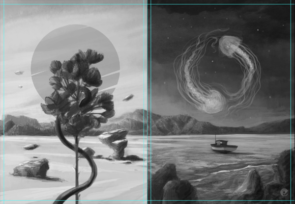
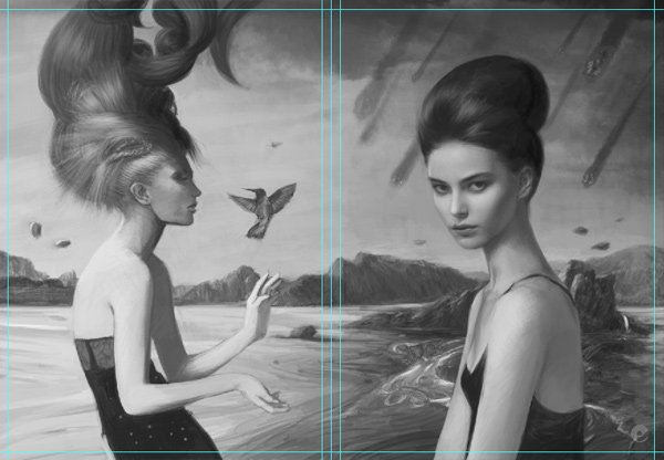
Mentioned this awhile back, im doing a mailout relatively soon- i decided to go with a nice postcard accordian fold. Taken me awhile to get around to actually working out what sort of thing i wanted to do. Finally finished a reasonable grayscale sketch, a few things are off a bit and the graphic elements are all missing, (i tend to work those details out as i go along) but its pretty much there i think. Will be cracking on with the high res version asap.

As you can see from the previews, its a large landscape piece that broken down into the panels reflects the 4 elements. When its folded you should also get Earth and Water to make a smaller landscape of their own. Looking forward to working out the details!


Thursday, 16 September 2010

Telegraph Fashion Illustrations

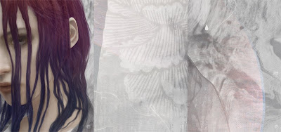
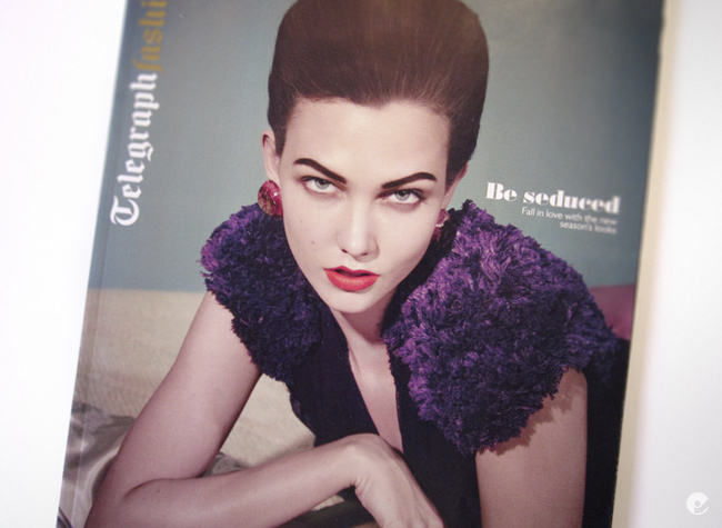
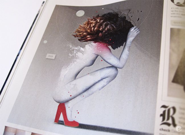
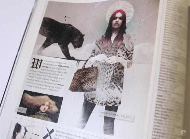
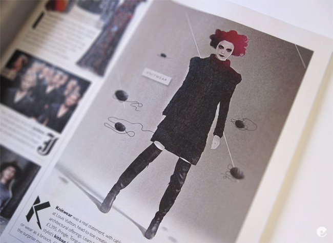
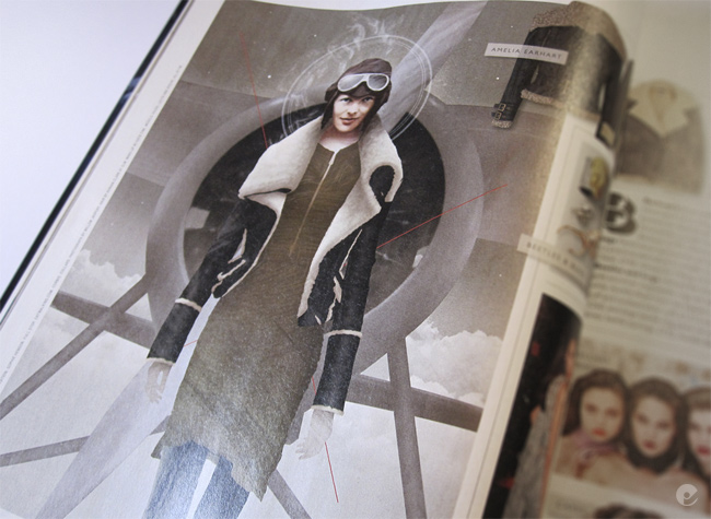
Last weekend saw the release of the Daily Telegraphs Fashion supplement for Autumn / Winter and within its pages are my recently commissioned works. Im really pleased with how these came out thanks to some good direction from the AD at the telegraph. Its great to have a brief with a strong starting point but also be able to have a pretty free reign in its interpretation and execution. In case you missed it, heres some shots of the work in-situ.


Tuesday, 17 August 2010

Computer Arts tutorial

Ive just finished an illustration and tutorial walk-though for the nice chaps at Computer Arts magazine. Issue 180 has a sexy theme and i was asked to produce something as a full page illustration together with a step by step breakdown of the process. Im pretty happy with the end result but as the issue isnt out yet i will just give you a little preview and give you a better view of the article when it hits the shelves.

Friday, 11 June 2010

Queen Adelaide Wine

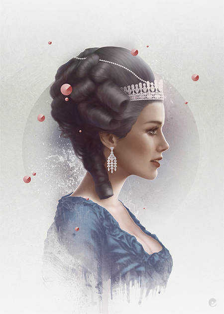
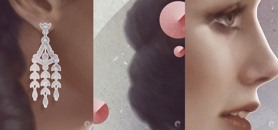
Heres a recent illustration commissioned for a pitch to rebrand the Queen Adelaide wine in Australia. Its really a contemporary portrait to reinvigorate the publics perception of the brand. Obviously this was just the portrait, im guessing that the label design would incorporate the image within a frame of some sort, ive no idea how it eventually got presented to the client.


Monday, 1 March 2010

Telegraph Fashion Illustrations

Heres some recently completed illustrations done for the Telegraph Magazines fashion section:


Fashion Illustrator 2 book

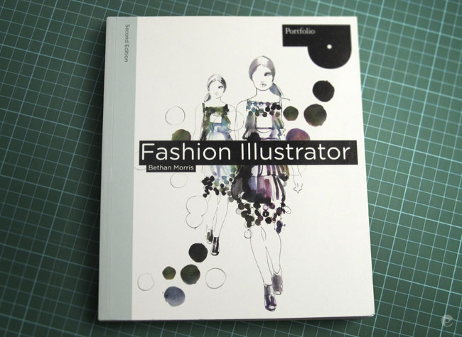
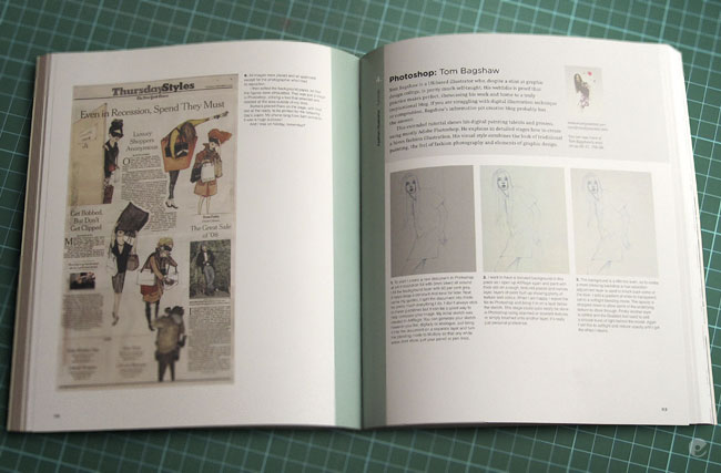
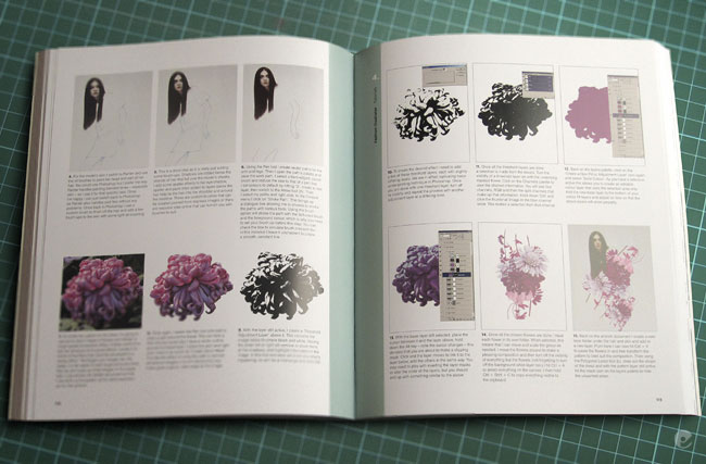
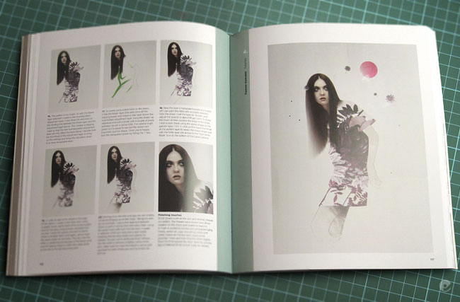
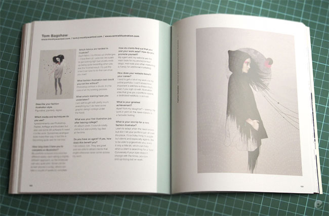
Finally got my copy of Fashion Illustrator- Second edition (ISBN-10: 1856696545). It seems like ive been waiting for this to come out for ages now, publishing times being what they usually are. Its a nice book- with a pretty good spectrum of artists interviewed, showcases and tutorials and is aimed at the fashion illustration student. Its similar to the first edition but definitely has more to offer.

I have a few pieces throughout the book including an interview spread and a pretty in depth photoshop tutorial on how i created the Duck and cover piece (blogged earlier) which now i re-read it, is probably utterly confusing to just about everyone. When youre working on something, some ways you do it come second nature youve done them so many times but at the end of the day theyre a variety of simpler and quicker routes to accomplish the same result. So apologies if you buy the book, read the tutorial and then say 'wtf?!'.

Heres the photos of the book spreads. Go buy it and let me know what you think!


Tuesday, 21 July 2009

Chloe

A new piece just completed with some detail shots below.


Monday, 11 May 2009

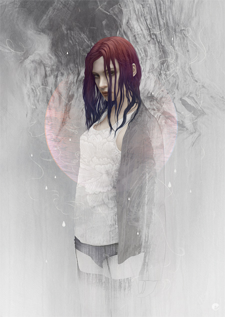
Fledgling process

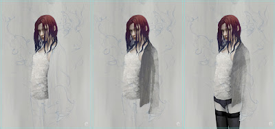
Finished up on this the other day and thought i would share a (somewhat longer) process post. First up heres the initial sketch drawn up in artrage on a neutral ground, this is drawn out at the same dimensions as the final artwork- (an a4 plus bleed document) once thats drawn out quite roughly in blue i neaten things up using a normal graphite color- namely the face as thats where the focus of the painting will be.

Still in artrage some texture gets blocked in using the oil textures and pallet knife. Then i can move over to painter and get the flesh painted in using the oil brushes and then its all photoshop from here on. Panel 3 shows the base shape of the hair painted in using a rough, almost fur or grass type brush.
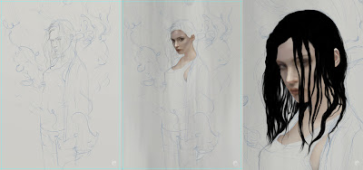


This is painted on a few different layers and then merged together when im happy with the shape. A layer mask is added and using the same brush- but a lot finer, I paint in the mask to clean up the shape of the hair- it also allows you to create gaps in thicker strands to allow light through and also is non destructive to the original paint.
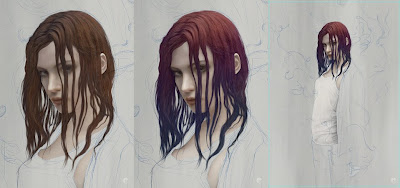


The next 2 panels show the detail being added, using a combination of brushes and the blur tool- layers are built up over the base hair layer as 'clipping masks', meaning that when you paint on each consecutive layer, paint is only visible where it overlays the base hair layer. Once the detail and form is done, final tweaks can be made- including a layer, set to color with reduced opacity where a tint of pink and blue is added.

The Third panel shows the vest started- a dark gray base shape layer is marked in using the pen tool then a solid white fill adjustment layer is created above and 'clipped' to the base shape. Then the folds are brushed in on the layer mask. This has the advantage of letting you adjust colors quite far down the process without too much hassle.


Further layers of texture and pattern are added to the vest stack using a variety of blending modes and opacities. The rest of the clothing is handled in a similar fashion, the jumper gets a basic shape drawn out with the pen tool which is saved and used as a group mask in which multiple layers of texture are added, each having their own masks which are in turn brushed using various textures. As the lower half of the body is only going to be partially viewable i dont worry about being too precise in creating her pelvis and thighs- painted in using a default hard edged brush does the job.

Once the clothing is done, each items group (eg the vest is one group of layers, the jumper is in another and finally the waist down) gets a mask and more texture is added, this is done in a couple of ways- texture brushes roughly painted in and also taken from texture photos. A pretty simple way of doing this is to find something with a suitable contrast, paste the image in on top of where you would like to add the texture. Once its there lower the opacity so you can align or scale it to your liking, reset the opacity to 100 and go to the channels tab, choose the best channel for the textures contrast and ctrl click the thumbnail. This loads the channel as a selection, hide the actual pasted texture layer, select your group mask and paint some black over the selection.
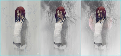


Next the background texture is created at the bottom of the layer stack, using some photo texture, brushes and masking. Back up at the top- the thread lines are simple paths drawn with the pen tool and 'stroked' with a default brush set with a pixel or two of blur and 'simulate pressure' checked. The resulting lines are slightly blurred and enhanced, grouped within a folder where yet another mask is made and areas brushed out and softened.

Finally in a separate top folder, additional texture, vector details, accent colors and touch-ups are made before a flattened version gets a small amount of noise added.

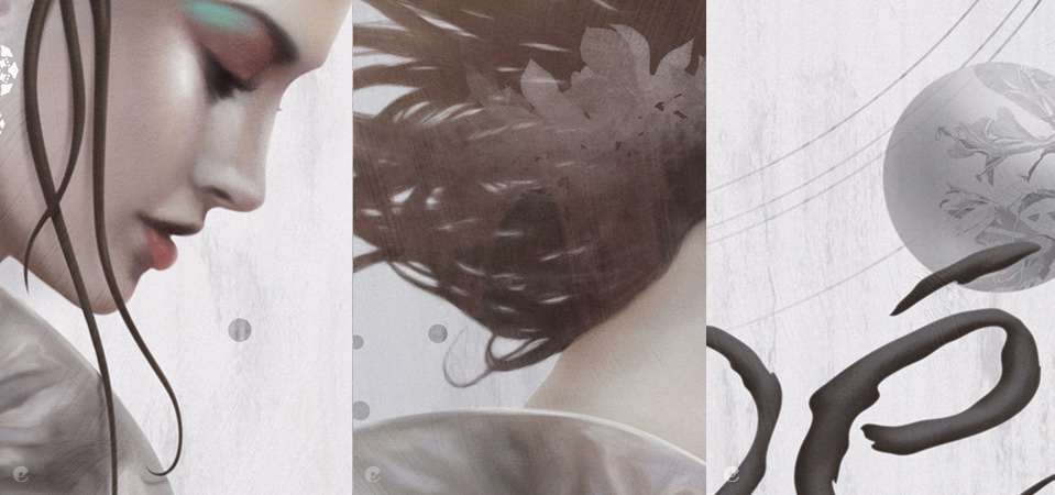
Final artwork and details.


Monday, 2 March 2009

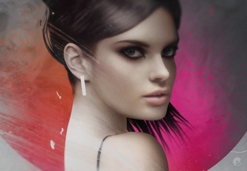
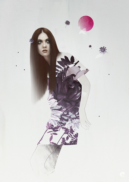
Another new pic

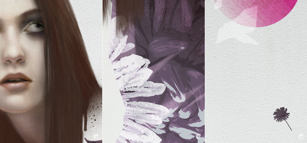
Heres another new image from the soon to be updated book 3 on the mostlywanted main site as mentioned in the previous post. This one is being used in a full tutorial in the 2nd edition of 'fashion illustration' by Lawrence King Publishers, written by Bethan Morris (thanks beth!). I have added a couple of close up shots but youll need to pick up a copy of the book when it hits the stores to be able to see the full tutorial.


As you may have noticed theres a very definite graphic feel to these new illustrations, i have tried to off set the harshness by using quite a bit of texture and wash, it seems to have been more successful in some images than others but at least i now have a few with which to build the folio on.

Im also in the process of sketching up a new painting that will end up in book 2- the more fine arty stuff- if you want to name the style! That should hopefully get posted up here soon. Thats all for now.

Monday, 26 May 2008

Finally- an update!

Sorry about the lack of recent updates, this is mainly down to lots of family fun, getting used to a baby can take awhile and certainly has its ups and downs, fortunately we seem to be over a tricky patch so hopefully things will run a little smoother. Ive also been working inhouse pimping my design services to various agencies, thats also been sucking up quite a bit of time- but im a bit more freed up now so with any luck i will be able to post some updates.
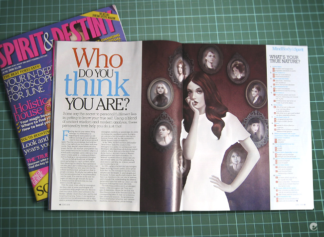
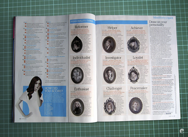
To kick things off, here's a recent illustration for Spirit and Destiny magazine, the article was entitled 'who do you think you are?' and was a quiz type thing to discover your personality type. The brief was quite specific and after worrying about some of the technicalities is was able to get it done within deadline.


Heres a couple of magazine shots to show the spread and what was done for the article:


Saturday, 22 March 2008

Bit of a break...

Once again a big gap in my posting, but with very good reason- i have been enjoying the arrival of my baby daughter erin- who has been keeping me exhausted but stupidly happy! When things settle down a bit i should be able to get around to getting some new work out and posting a bit more.

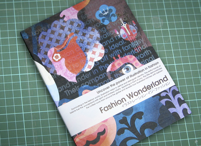
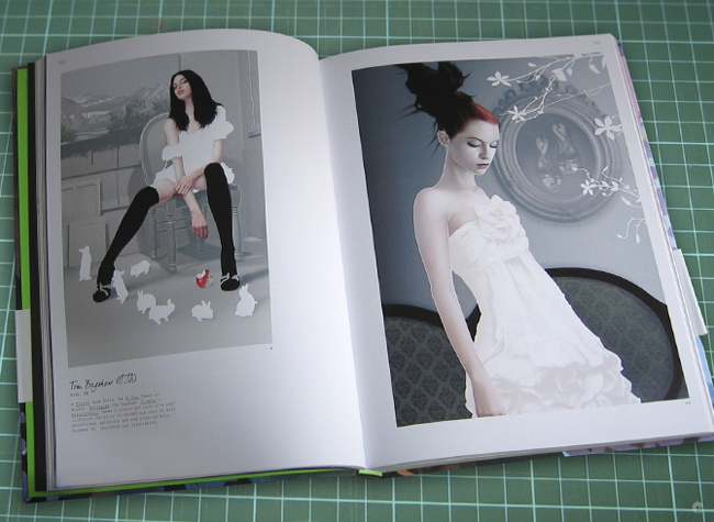
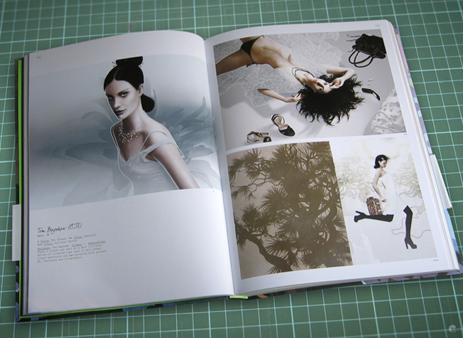
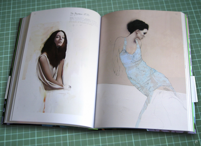
I have just received Victionaries latest book 'Fashion wonderland' for which i contributed some works. Fantastic book- buy it if you can, they tend to go pretty quick. Link to the Victionary site. Im also in the latest edition of Imagine Publishing's 'Photoshop creative' mag (issue 33) with a few tips and some pieces of work included in the digital painting feature. I will leave you with a look at the spreads for the fashion wonderland book. Back soon.