Thursday, 5 April 2012

Memories Project...

Awhile back i was asked to contribute to a charity art project that would go to help rasie money and awareness for the Maggies Cancer Caring centres. The Memories project was put together by Rishi Sodha, Stuart Boyd, Antony Kitson and freelance journalist and copywriter Garrick Webster.

Memories looks at the thoughts and experiences of individuals who have survived cancer, as well as those of people who have lost loved ones. There are ten stories inside, each looking at one person’s recollection of a particular day in the struggle against cancer. For each of these ‘memories’ a dozen leading artists, illustrators and designers have created their own visual response. Two further stories were ‘open brief’ and invited creatives worldwide to make their own images to accompany the text. The best submissions went into the book.

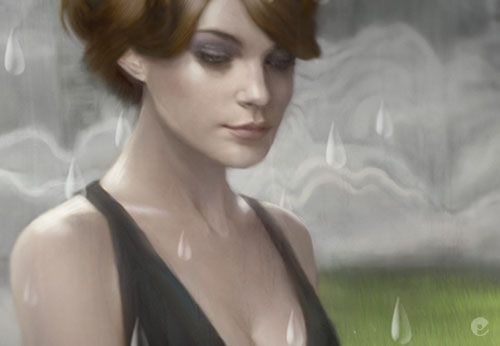
2 years later, the book was launched in Dec of 2011 and is available to buy direct from the Memories website. Below is a little look at my contribution to Patrick Woodcocks poem about the loss of his mother in 2006. Its a great book, with illustrations from a wide variety of artists and goes to help a worthwhile cause, order a copy while there are still some left!

Tuesday, 7 June 2011

CLIO Awards...

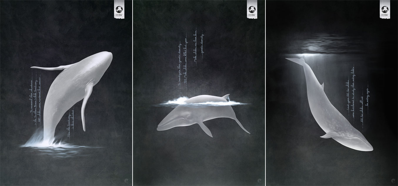
I recently found out that my illustrations for JWT Melbourne for the IFAW Anti Whaling Campaign had won Silver and Bronze in the CLIO Awards 'Print' category! There was also a silver award at Adfest earlier in the year for the same and they were shortlisted for D&AD as well which was pretty cool. Congrats to the guys at JWT especially @HarshKapadia9 who i dealt with throughout the job.

Tuesday, 10 May 2011

Skullface...

Awhile back i got asked to contribute my Odokuro piece to an upcoming book called Skullface being put together by the nice chaps at Korero books. Compiled by Yak El-Droubie Skullface gathers over 70 artists to get to grips with Death in all its guises. An unequaled showcase of today's painters and illustrators, featuring the likes of Alex Garcia, Ron English, Jeff Soto, Shawn Barber, Mike Giant and Jeral Tidwell. Today i got my copy through the post (thanks guys!) and its a really amazing book- if you like anything to do with skulls, go get it now! Heres a couple of quick Instagram pics:


Monday, 21 March 2011

Design Week...

Just picked up this weeks Design Week magazine, theres an interesting article on the 'hopefully' better 2011- with consultancies getting work in and starting to hire again, together with some figures for salary comparison between 2009-2010 (drawn from a recruitment agency questionnaire). Theres also a great piece by Garrick Webster that looks at illustration and the realm of technology. I got to throw in my 2 cents worth in 'talking tech'. Its funny that while everyone gives a valid comment about the subject- im the only one who mentions the costs involved in using tech to create! I often think its an overlooked area when people are talking about digital art, but maybe its just something that people are willing to accept mainly because traditional art materials are so expensive... at least with digital software your paint doesnt run out i suppose!

Anyway, if you get a chance to have a flick through it on the news stand or buy it, check out the article.


Thursday, 23 September 2010

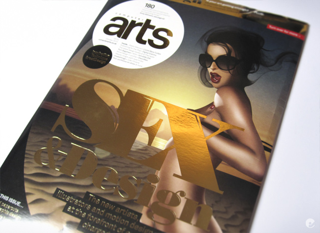
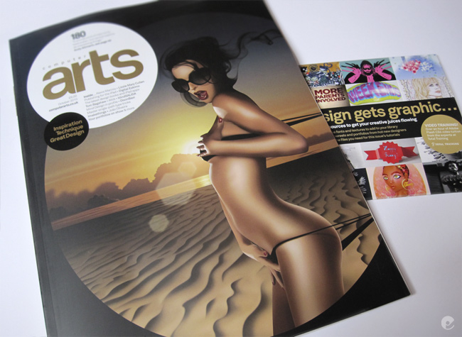
CA 180, The Sex Issue

Computer Arts magazine Issue 180 is now on the UK stands and as you may gathered from the title here- its the Sex Issue. To quote a little from the release copy:

'Whatever your opinion of it, sexual imagery within design is rife, and will almost certainly always be a part of the industry. So, this month we investigate, through a series of features, what is so alluring about erotically-charged design.'

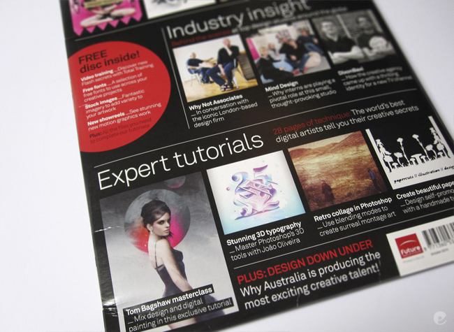
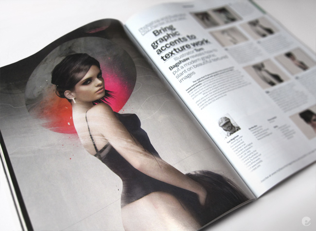
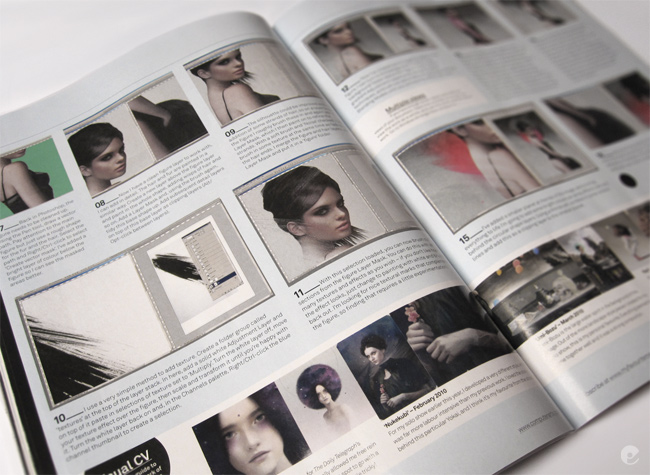
Ive done a new image and walk-through on its process for the issue so heres a few photos of the spreads. I have to say that im really looking forward to giving this one a read- from the quick look ive given it so far it looks like a great issue with some top notch content from a great array of contributors. Check out the images below and then get out and grab yourself a copy while you can!


Mailout sketch

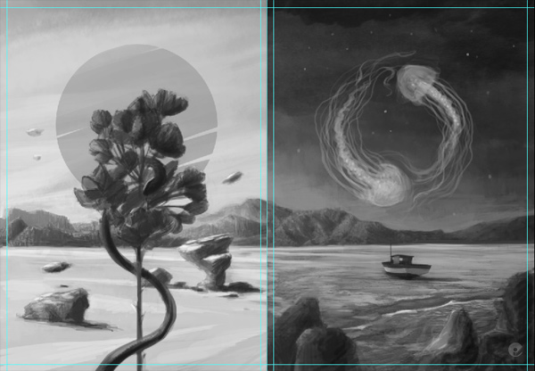
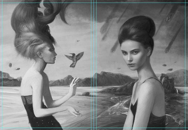
Mentioned this awhile back, im doing a mailout relatively soon- i decided to go with a nice postcard accordian fold. Taken me awhile to get around to actually working out what sort of thing i wanted to do. Finally finished a reasonable grayscale sketch, a few things are off a bit and the graphic elements are all missing, (i tend to work those details out as i go along) but its pretty much there i think. Will be cracking on with the high res version asap.

As you can see from the previews, its a large landscape piece that broken down into the panels reflects the 4 elements. When its folded you should also get Earth and Water to make a smaller landscape of their own. Looking forward to working out the details!


Tuesday, 27 July 2010

Yokai competition closed

Thanks for the overwhelming response everyone, its really cool that so many would like one of these little flyers! I am going to be picking out the 20 winners (thats all the flyers i have left out of 250 for the show!) via the extremely useful random.org which is probably the fairest way to 'randomly' select the winning names.

Unfortunatley i wont be able to let you know whether youve won or not, so to all who have entered i will say a big 'thank you', even more so to those who not only entered, but also wrote little notes- its very much appreciated!

The winners will have their flyer posted out to them tomorrow (weds 28th July), hopefully the post services around the world will be good and get them to you quickly. (not holding out too much hope on that one) There have been a lot, probably about 2/3 of entries from the USA with the rest scattered around the UK, France, Spain, Portugal, Russia and a couple from the far east. Quite interesting to see where some of you guys are!

Anyway, thanks again, i think with the success of this i may end up doing another little contest soon!

Tuesday, 13 July 2010

CIA Book press release

The Central Illustration Agency have passed on the press release for their debut book 'License to Inspire'. Its currently available on pre-order from amazon but will soon be gracing book stores worldwide. Heres the press release...
-
License To Inspire
The Central Illustration Agency's book debut.


A collection of work from some of the world's most inspiring illustrators and the story of the agency that represents them.

License To Inspire is an eclectic mix of stunning artwork and fascinating interviews from the world's most talented illustrators and industry innovators. An invaluable resource for art buyers and other professionals within the creative industries, this will soon become a recommended text for art students and particularly those who wish to work in the industry. With inclusions from a diverse range of artists from Jonas Bergstrand to Sir Peter Blake, the book is packed with beautiful images and thought-provoking words. Created by the acclaimed Central Illustration Agency, who have been associated with the brightest talent in illustrative art since 1983, this book will be an essential addition to any coffee table or agency library.

"Illustration has been arguably the liveliest art form of this decade, and CIA have been right in the centre of it. This Book paints a brilliant and lively portrait of the world, the art and the business of contemporary illustration."
-Marc Valli, Elephant magazine & Magma.


Contents:
License to inspire. Now. And how now happened.
-A commentary charting the origins of the Central Illustration Agency from its inception in the 1980s to present day – a journey taking in some of the most memorable advertising campaigns and evocative book covers of the last few decades.

The mechanics of a job: a relatively simple case study.
-A case study tracking the progress of a job from commission to completion.

The artists.
Showcasing work from some of the worlds most talented illustrators, including:

12 foot 6, Ahoy There, Nik Ainley, Tatiana Arocha, Tom Bagshaw, Andrew Bannecker, Jonas Bergstrand, Ian Bilbey, Sir Peter Blake, Bernard Blatch, Greg Bridges, Christopher Brown, Mick Brownfield, Lesley Buckingham, Susan Burghart, Stanley Chow, Nishant Choksi, Sarah J Coleman, Haydn Cornner, Jimi Crayon, Dust, Tristan Eaton, Max Ellis, Fine & Dandy, Jeff Fisher, Jessie Ford, Andrew Foster, Nathan Fox, Jonathan Gibbs, Chris Gilvan Cartwright, Good Wives and Warriors, Brian Grimwood, Martin Haake, Pete Harrison, Lee Hasler, Sara Hayward, David Holmes, Darren Hopes, Peter Horridge, David Hughes, M. H. Jeeves, Kai & Sunny, Chris Kasch, Carol Lawson, Tina Mansuwan, Tim Marrs, Mick Marston, Chris McEwan, Clare Melinsky, Kate Miller, Dave Needham, Gary Neill, Jeff Nishinaka, Paul Oakley, Nigel Owen, Jackie Parsons, Jitesh Patel, Pirates, Wendy Plovmand, Ulla Puggaard, Maria Raymondsdotter, John Royle, Harriet Russell, Jeremy Sancha, Yuko Shimizu, Paul Slater, Ray Smith, John Spencer, Simon Spilsbury, Spiral Studio, Louisa St. Pierre, The 3D Agency, Alex Turvey, Mark Thomas, Benjamin Wachenje, Paul Wearing, Richard Wilkinson, Mike Wilks.


Back-word. What inspires Brian Grimwood.
A few words from the agency’s founder, whom Print Magazine described as “having changed the look of British illustration”.

In Conversation with:
Sheri Glee, Art Director at the Folio Society, Sir John Hegarty, BBH, Paul Slater and Tom Conran at the Cow, Sir Peter Blake at his studio and Katie Grogan, art buyer.


Edited by Benjamin Cox.
Designed by Staziker Jones - http://www.stazikerjones.co.uk/
Published by Pirum Press - http://www.pirumpress.co.uk/

Printed in Italy by Printer Trento Slr. Content, end-papers and cover wrap printed on Munken Print Cream, cover in Cialux cloth.

ISBN—13: 978-0-9565729-0-5
Publication date: 14 July 2010
Launch date: Early Autumn 2010 (tbc)
Price: RRP £25.00
Format: 246 x 189mm, case-bound
Hardcover: 256 pages

Will also be stocked in various hand selected, worldwide book, gift & interior stores, including Magma. More images & spreads available upon immediate request.

To receive a copy for review (or for your coffee table), please get in touch with CIA.

For more information or interviews, contact Alicja McCarthy on:
+44 (0) 207 73 7187
e: alicja@centralillustration.com
www.centralillustration.com
-

Monday, 12 July 2010

Hullo all...

weeks pass and i have started getting a nagging feeling that i should be posting something here. At the moment im trying to get some new work done, working on a piece for the November group show at London Miles Gallery where im happy to say my work will be rubbing shoulders with some awesome artists!

Im also happy to be doing more work for the Telegraph magazine, doing illustrations for the fashion supplement. Ive also just finished a book cover for Little Brown Books, the UK edition of Kelly Armstrong's 'Gathering'. Hopefully i will be able to post them up soon.

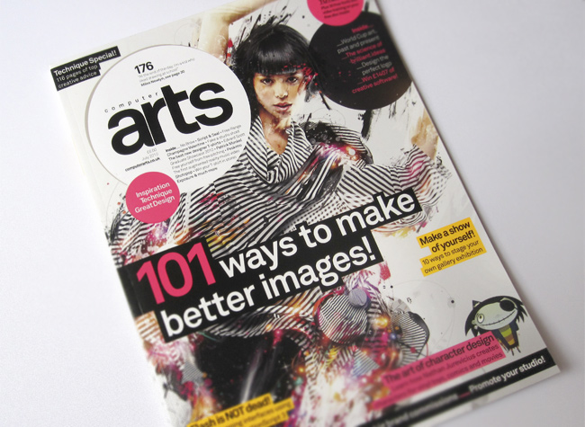
For the July issue of Computer Arts magazine, they ran a series of articles for the 101 ways to make better images feature. I was kindly asked to provide 10 tips for the 'Brushes' section. If you havent seen the magazine heres the cover and my tips (theyre worded a lot better in the actual article!)


Get a Tablet!
To fully make use of the brushes in the major applications you really need a tablet. Once one is hooked up all the various brush options like pressure sensitivity, opacity, color dynamics, shape and scattering all become accessible and it also allows you to create work in a more intuitive way.

Rotate brushes
Its often an overlooked ability in the brush presets, but simply changing the rotation of a brush can produce some dramatic effects and is a feature worth playing around with if youre looking for something new. Obviously far more effective with brushes other than a basic circle tip!

Make custom brushes
It’s a lot easier than people expect. Most applications like Photoshop, Painter and Illustrator give you the ability to quickly make a new brush preset, fine tune the opacity, stroke, pressure and then save it for further use. Textures, marks from other brushes, photographs- all can be made into a new brush to breathe life into your work.

Download custom brushes
If you feel unsure about the process of creating your own or are pushed for time, there is a bunch of sites dedicated to sharing brushes that others have created. Most are free for personal or commercial use but some do require a credit so check what you download. Most brush repositories enable you to search for what youre after using basic filtering so it can be a quick way of finding a new effect.

Blending
For more realistic painting your digital paint can be blended together to produce soft transitions of colour. Corel Painter has the largest selection of brushes that replicate traditional media, blending paint in possibly the most realistic fashion. Photoshop 5 has introduced some new bristle brushes that accomplish a similar effect, in older versions using the smudge tool with a low opacity can also be used.

Brush Cursor
Most of the time the brush cursor is set by default to the standard outline of the brush tip which changes size as you increase or decrease the brush size. For the most part this is a fine way to paint but occasionally for detailed work or when youre zoomed in this display of the brush can get in the way. Temporarily switch over to the cross-hairs of the precise cursor by hitting the Caps lock on.

Add a layer style
When painting on layers your brush strokes can be given an extra dimension by adding a layer style. Simple brush marks can be given a variety of effects that can remain editable throughout your work-flow.

Default brushes
Its easy to forget that applications like Photoshop, Painter and Illustrator all come with brush libraries that have been created as a default toolset. Basic round head, soft, calligraphic, natural, wet and dry brushes are all useful and in many cases all you really need for many jobs.

Ditch the dodge and burn tools
Many creatives use the dodge and burn tools, most with subtlety, a few like a sledgehammer. Instead of jumping straight to those tools try the brush but change its mode to color dodge or color burn. It works best on a very low opacity and flow and instead of using a color to paint which can have some undesirable effects try using a mid range- dark gray.

Manage your brushes
Many people are so busy downloading or creating custom brushes they don’t realize that their brush library has become a ram sucking nightmare. Try to keep a default brush library that has a few of your most used brush types and either delete or create new brush libraries for the others. Name the library files in a way that will enable you to swap libraries in and out with ease for the job you are working on. Eg. Fabric textures.abr, foliage.abr, sketching brushes.abr.
-
Obviously theres a lot of other creatives talking about a variety of other subjects, certainly worth a look if youre at the news stand!

Im also in the process of sorting out the mostlywanted shop. Im going to be able to direct buyers to places where my work is currently for sale and also be putting out limited editions myself. If you would like to know when the shop goes live (and it may be a little while yet!) please pop over to the mostlywanted.com/shop page and register your email address where you will be added to a simple mailing list. You wont get anything else from me other than a single mail to let you know the shop is running- i wont be bombarding you with junk!
Friday, 11 June 2010

Queen Adelaide Wine

Heres a recent illustration commissioned for a pitch to rebrand the Queen Adelaide wine in Australia. Its really a contemporary portrait to reinvigorate the publics perception of the brand. Obviously this was just the portrait, im guessing that the label design would incorporate the image within a frame of some sort, ive no idea how it eventually got presented to the client.


Monday, 1 March 2010

Telegraph Fashion Illustrations

Heres some recently completed illustrations done for the Telegraph Magazines fashion section:


Fashion Illustrator 2 book

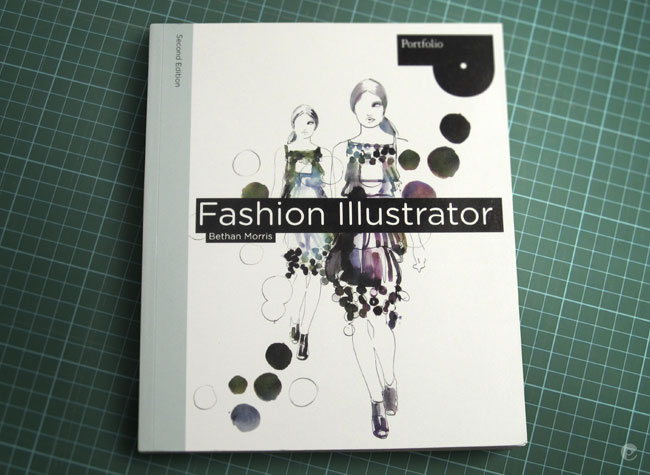
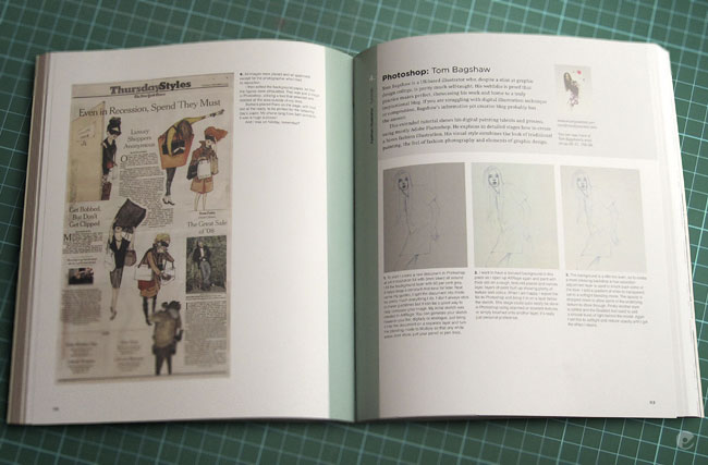
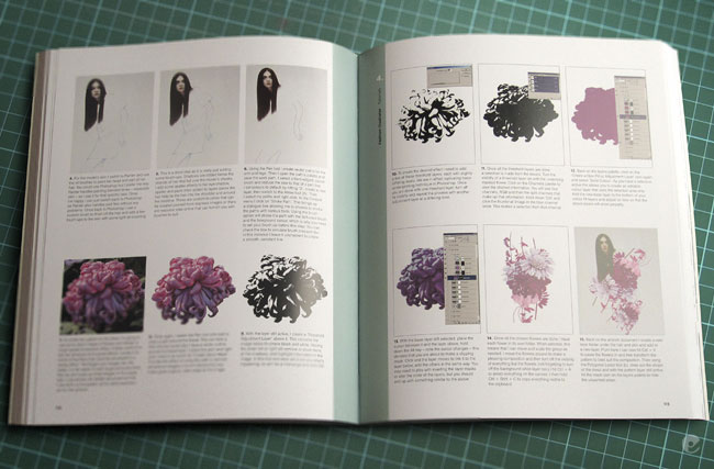
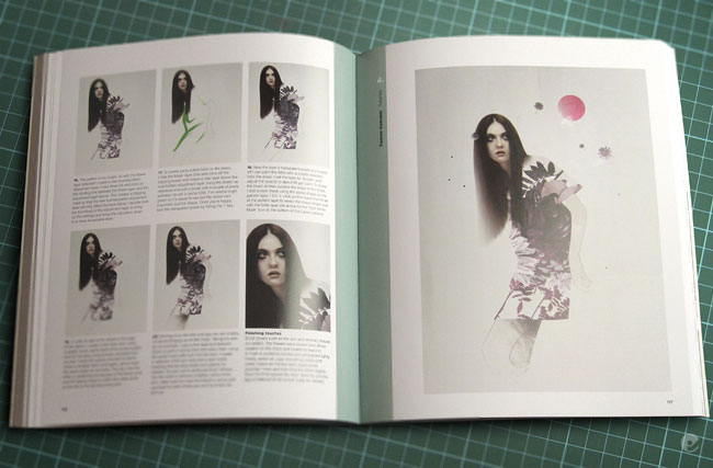
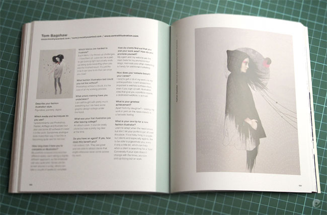
Finally got my copy of Fashion Illustrator- Second edition (ISBN-10: 1856696545). It seems like ive been waiting for this to come out for ages now, publishing times being what they usually are. Its a nice book- with a pretty good spectrum of artists interviewed, showcases and tutorials and is aimed at the fashion illustration student. Its similar to the first edition but definitely has more to offer.

I have a few pieces throughout the book including an interview spread and a pretty in depth photoshop tutorial on how i created the Duck and cover piece (blogged earlier) which now i re-read it, is probably utterly confusing to just about everyone. When youre working on something, some ways you do it come second nature youve done them so many times but at the end of the day theyre a variety of simpler and quicker routes to accomplish the same result. So apologies if you buy the book, read the tutorial and then say 'wtf?!'.

Heres the photos of the book spreads. Go buy it and let me know what you think!


Friday, 29 January 2010

Another preview

Just finished the 4th in my new body of work, this one actually went down without any complications- at least nothing that meant me spending days re-working a section (unlike the last piece). I would love to show everyone all of whats being produced but im trying to keep this whole body of work relatively unseen until the show, bear with me, hopefully the end result will be worth the wait. Until then i will post up small cropped sections like this- just so you know im not being idle!

With my head in work so frequently i havent been doing much online surfing recently and only just noticed that the Apple ipad has finally dropped on the official site. Like many- i had heard something new was being produced by Jobs and co and was interested to see what was to come- and yes- its great, a big-ass ipod touch. If you havent seen it yet- check the link and check it out, another beautiful piece of design and tech merged.

-- Begin Rant.

I dont mention it that often as it tends to get me quite a lot of flack, especially from the design community- but i work on a PC. Dirty, i know- but at the end of the day i need a computer to do its job, my setup is a custom build that after 4 years is still pretty bloody fast, still has ample storage etc... it cost half of an equivalent Apple system. Ive worked on both platforms- a lot, both have problems with their OS in terms of crashes, hanging- apple just looks great doing it. My desk has a million wires behind it from the tablet, keyboard, monitors, printers, power, external HD's, but it does work. Im not extolling the virtues of being on a PC, far from it, if i could afford the same spec kit i would happily trade it all in without even thinking about it- and for one reason: it looks better. From build to OS, apple have it nailed in terms of product design.

But i cant afford to swap out all the kit i own, i dont have thousands of pounds lying around- so i must live out my professional life, shunned and ridiculed when i am asked the question that only a mac user will ask 'are you on mac?'. Rant over- i will likely have to trade in my v2 ipod (that is still going strong- it just doesnt mount on usb too well anymore and the backlight and contrast are nearly gone) and get an ipod touch and now im kicking myself for buying a little netbook purely for online surfing, mail etc in the eve because now a comparatively well priced but purely more awesome gadget is due to be released in the form of the ipad. Bugger.

-- Stop.

Anyway, sorry about that, wont happen again- heres the preview. Enjoy.

Friday, 22 January 2010

Finally- a 2010 post.

Hi all, been stupidly busy and once again have fallen a little behind with the blog, couple of new pieces done for the show (small section teaser of one below) got quite a lot more to do and the initial thumbnail sketches i did have slightly misled me into thinking doing the actual paintings will be relatively simple.. nope.

Anyway, on top of that theres a few other jobs in the pipeline, not much i can mention here at the moment but hopefully i will be able to post up something more later. One thing that i can say is that ive gotten involved with Memories project and will be doing a piece for the show / book. If you havent read about it yet check out all the latest info on the Memories site. Heres some background on the project:

'Memories will look at the thoughts and experiences of individuals who have survived cancer, as well as those of people who have lost loved ones. There will be ten stories inside, each looking at one person’s recollection of a particular day in the struggle against cancer. For each of these ‘memories’ a dozen leading artists, illustrators and designers will be creating their own visual response. Two further stories will go ‘open brief’ and we’ll be inviting creatives worldwide to make their own images to accompany the text. The best submissions will go into the book.

That makes for 12 touching stories, and 144 smashing pieces of artwork

The project is being launched this summer by Designers Against Human Rights Abuse (DAHRA), Subism, OneTenEleven Media and editor Garrick Webster. Along with a number of writers and, of course, all the image contributors, they’ll be volunteering their time and skills to the project. We expect it will take a year to complete, culminating in the launch of Memories and an exhibition.'

From the current line up of contributors it looks like its going to a really good mix of work, looking forward to getting started on it!

Finally, heres the teaser for the recently finished show piece, back with more soon.

Friday, 27 November 2009

IFAW ad campaign

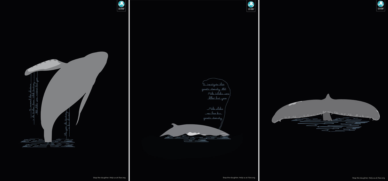
I got asked to help produce the latest print ads for IFAW's (International Fund for Animal Welfare) Save the whales campaign. The whaling season started this month and the ads have gone to press. The campaign was produced for IFAW by JWT Melborne. Below is the concept as delivered from JWT, it was something that i was fully prepared to do in a full colour, painted manner but the feedback was that they wanted to keep it this simple- a little outside what i was expecting but i think the result works well.

The campaign was intending to stay away from the usual shock tactics and gore, hence the simplicity of the initial designs, as i began working on them they took on quite a ghostly appearance- something i pushed into the final design. The copy was intended to give the suggestion of running water, i havent received the final artwork with the right copy but apparently its not far off these.


In other news, im currently working on a new body of work with the view to having a show in the first part of next year. As a consequence things may go a little quiet here, bear with me and i will hopefully be able to give you some peaks at the works as they progress.

Wednesday, 11 November 2009

CIA 2010 calendar launched

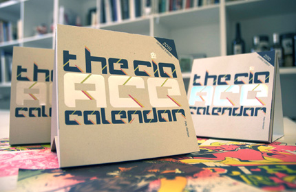
Its that time of year again, the new CIA 'ACE' calendar for 2010 has been set free and is now available to purchase. Check out the CIA Shop for more information. Below is a couple of press shots and at the bottom is my image, hopefully it makes sense in the context of the calendar, if not- at least it should be odd enough to catch your eye!


Tuesday, 4 August 2009

Kokeshi Show

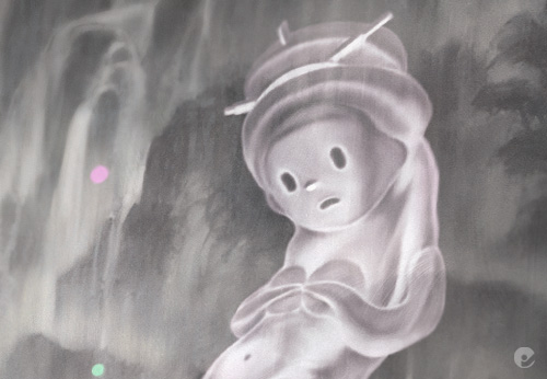
For awhile now ive been seeing various artists showing or mentioning about having a piece shown in a forthcoming Kokeshi Show at the Japanese American National Museum and it seems like its finally here. Arrested Motion posted an entry regarding the show 'Kokeshi: From Folk Art to Art Toy' and have posted a series of fantastic photographs from the exhibition. You can view the museums complete selection of dolls here, some of which are still available to buy. Kokeshi: From Folk Art to Art Toy

Heres a few of my favorites but make sure you check out the Arrested motion post and the Museums pages for other great works.

Tuesday, 21 July 2009

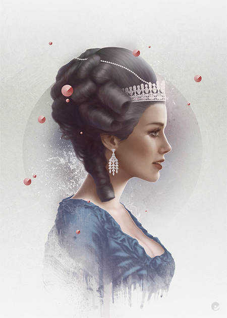
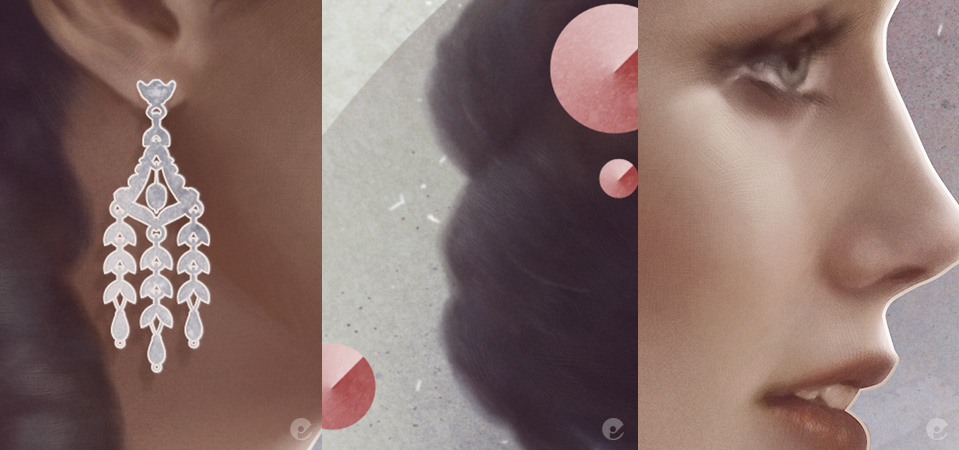
Chloe

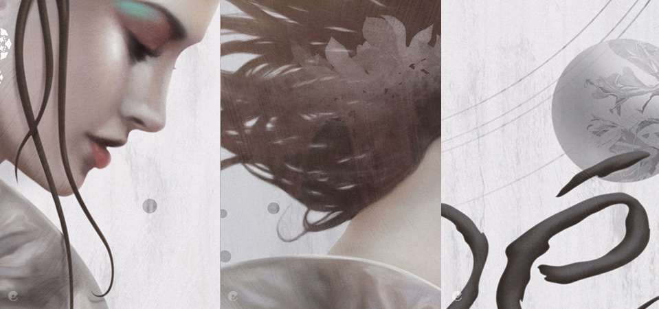
A new piece just completed with some detail shots below.


Monday, 27 April 2009

Typographic illustration


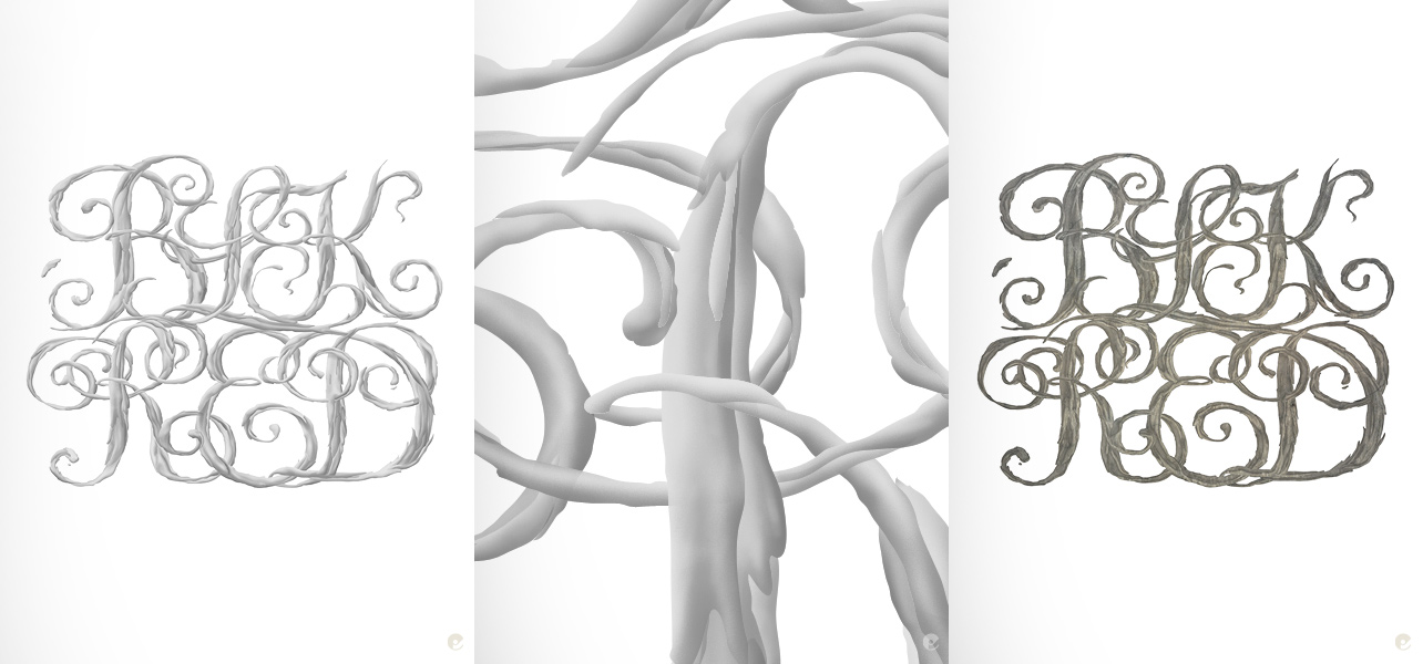
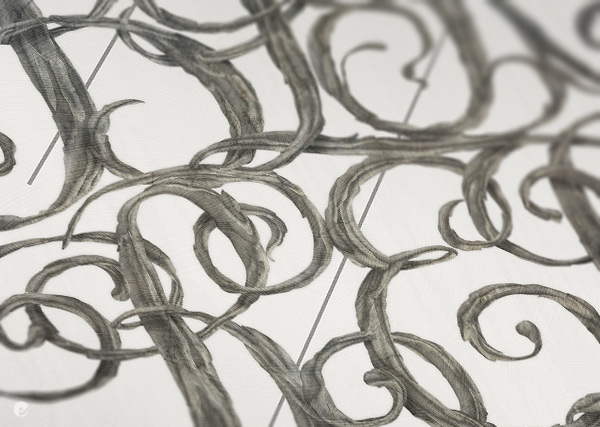
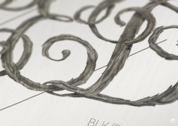
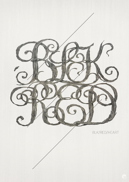
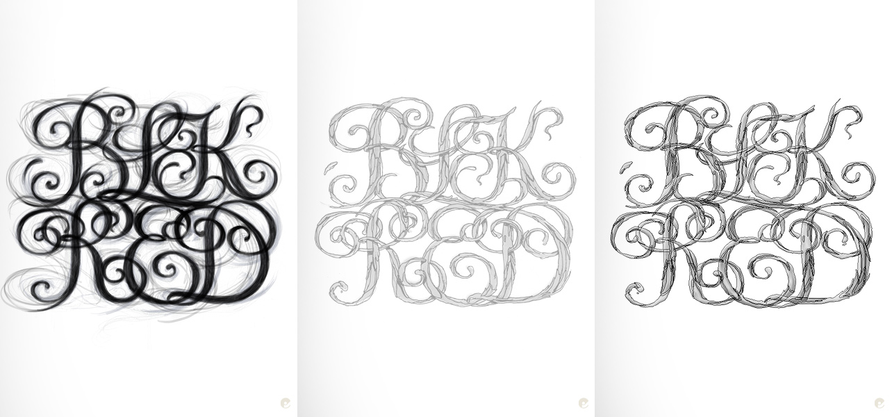
Here's a recent experimental typographic illustration, playing with shape and texture. The initial sketch was scribbled in photoshop and progressively cleaned up and refined, once i was happy with the outline the internal shapes were sketched and then penned in illustrator and brought back into photoshop as paths. These shapes were then used to create individual selections where is was able to airbrush in the form.


The overall outline path was used as a shape layer with which to add and create grouped layers of texture, masking and adjusting each as i went and adding the form layer to the top set to multiply mode and the opacity adjusted.


After that it was just finishing touches, highlights, lowlights and background.


Friday, 17 April 2009

Collaged drawings

Val Britton has some amazing collaged drawings. 'The impetus for this body of work was my longing to connect to my father, a truck driver who drove eighteen-wheelers across the country hauling industrial machinery.' The rest of the artist statement makes for a better understanding of the work and an appreciation of the forms created.