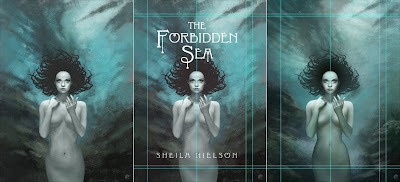
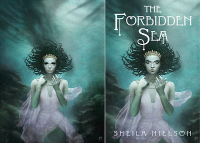
Here is my promised walk-through on the creation of the cover artwork for The Forbidden Sea by Sheila Nielson for Scholastic Books. Its the most in-depth one ive done so- be prepared. The initial synopsis for the book gave me some background info on the story and detailed character descriptions.
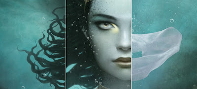
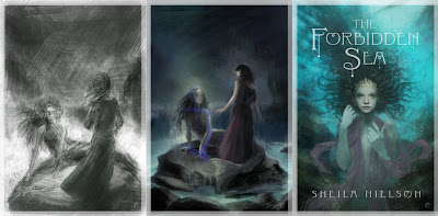
The initial sketches were very much based in the narrative, trying to stick to the information i was given as closely as possible but it just wasnt working. So the initial composition was ditched in favor of a more portrait style cover- something im far happier with and after a few variations a suitable sketch was given the green light. Below are the primary first steps. From the left, the speed paint to give an idea of composition, the color reworked version after some feedback and finally a more worked up portrait sketch. As you can tell, these are very quick and arent concentrating on anything more than composition color and mood, the final sketch had more work done on the face to try and convey the focal point of the face and the eyes which are golden in the book description.
The first steps were to create a working document, the working file is larger than the final deliverable document but both have the same areas. The actual cover dimensions, bleed and then enough room for any additional wrapping that may be needed at a later date. Once the master working file is setup with guides and a base layer of the sketch stretched up and a top layer of the supplied cover typography (in black and white and set to screen mode so only the type shows through) i can get on with the painting.
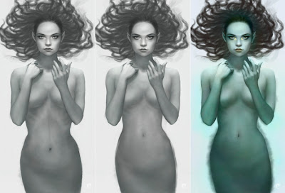
From left to right (and on all other subsequent images), the pencil sketch is set on a top layer on multiply, painting can then be done on layers below to generate form. The first stage is roughly blocked in with a hard edged brush in photoshop, refining the form and lighting in black and white at this point. Im working in bw because the final skin will be primarily made up of greens and blues which can be added on top. The next panel shows the photoshop base sketch after it has been flattened, taken into painter, blended, then painted using digital oils. The result is then opened back in photoshop where the mermaid is separated from the background using a combination of clipping path and mask. In panels 2 and 3 you can also see that i have refined the hair.
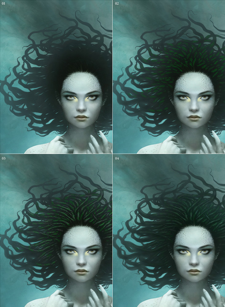
In the description of the mermaid, her hair sounds like it should have been dreads, certainly rope like and intertwined with braids of various hues of green, with a golden bead at the end. Unfortunately this just didnt feel right for the image. Dreads just dont move very well underwater so i took some artistic license and gave her hair a more 'sea anemone' feel that would flow and give her some movement.
The basic shapes were roughly brushed in and then a layer mask was added and then painted back. I tend to do this a lot, its non destructive and allows me to remove and refine strands of hair as need be and also create additional layers above that can be added as clipping masks, effecting only the base shape. Depth, color, adjustments etc all only effecting the bottom shape layer. Heres the hair before and after the masking is done.
The figure gets a rough scale pattern added, just experimenting at this stage and the background is worked up with a variety of custom brushes. Its a good thing to check on whats happened so far so the guides are displayed and the type is turned back on. This thows up some problems with the mermaid that are addressed shortly. In the 3rd panel the reworked mermaid is added and more work is done on the background.
In the previous steps i spoke about the issues i had with the mermaid. This shows what was done. As you can see in the first panel, the bottom half of her looked a little odd. Fortunately as she is separate from everything else it was simple enough to go back and make the alterations. Panel 2 shows the remodeling in progress. Once i was happier with the shape i was able to start adding color via separate layers set to color mode in PS. Once the majority of the tints were done i jumped back to painter and continued to refine the figure but this time using full color oils.
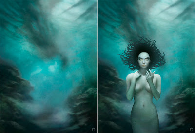
Once the mermaid was more finalized i could move to the background. The rough underwater landscape was flattened down and taken into painter and worked up, i had kept a flat guide layer in the file that was a low opacity version of the mermaid, hair and type, helpful for deciding on more detailed lighting and color choices. Once completed, its back to PS. The mermaids hair gets a little light airbrushing on a clipping layer to co-ordinate with the background and texture gets added to the mermaids skin.
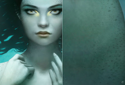
I had always envisioned her with scales, not just the assumed tail / pelvis area but also subtly over her whole body. So after a lot of searching i found some stock fish scale textures and managed to get her looking suitably fishy. While looking around at a lot of fish it became clear that she really needed some other patterning to help bring her to life.
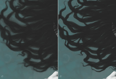
Onto the hair. As i mentioned before, the hair base is just one flat layer with a mask so add the following effects are just built up on top as clipping masks. 01: the ends of the hair lightened to tonally match the sea and the focal area really darkened down. 02: more definition is given to the strands and the first steps of the lighting are added. 03: the braids are further developed and finally blurred with highlights added on a softlight layer.
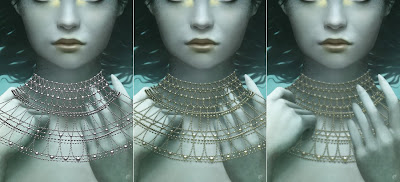
In the description the mermaid wears a crown and a gold bead necklace over her neck and shoulders like a fine dew laden spiderweb. I had sketched this in the early stages and as i went along decided that she also needed some bracelets to help break up the expanse of her forearms. The jewelry was all done in a very similar way, i flattened everything down, saved it out as a jpg and used this as a placer in illustrator. Multiple beads were created in bw with a simple radial gradient and laid out in the desired shapes. Once i was happy with my vector artwork it was pasted into ps and the layer duplicated and treated with hue / saturation adjustments, blurred, and masked.
Again, the technique i use for creating the dress is something ive done many a time so its something i can do quicker than try to explain, but here goes.
On a new layer i sketch out the shape i want for the material, once thats ok i create a series of paths that i can use later as selections and use them to create a simple fill layer of my base color. With all the paths active i make a selection, hide the fill layer and copy all thats visible to the clipboard. With the selection still active i create a new channel, paste into the selection and then start painting the folds in bw.
After blurring, some dodge and burn and refinement i end up with a clean channel as per panel 2. I can then make a selection from this to add a mask to the vector fill layer giving me the basic transparency of the material and then using the same selection add fill layers to that base shape as clipping masks. Its just a case of shifting levels and some gentle airbrushing to add highlights etc in various colors. All of which- being fill adjustment layers can be easily fine tuned as needed.
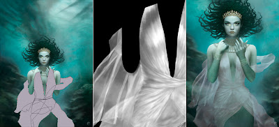
Bubbles and overlying textures are added as final touches. The bubbles are a combination of custom brushes on multiple layers, all set to screen and masked to help give more depth. On the right is the final submitted version.
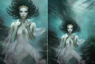
After the initial good feedback some issues were raised that required some additional alterations. First the shadows and highlights that gave definition to her breasts needed to be reworked to flatten her chest somewhat, then more color was added to the material. Finally it was decided that her dress was too revealing and i needed to go back and rework it to hide more of her exposed chest. Fortunately that was it. Here is the finished painting and on the right the cropped version with the type placer overlay. I believe the type will be gold foil and embossed to tie in with the jewelry but that could be subject to change.
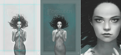
Once the painting is finished at its working size it is a simple case of transferring a flattened version to the deliverable size document and checking to make sure colors are in gamut etc. Heres a few detail shots to sign off!