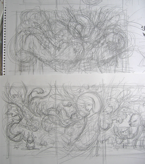
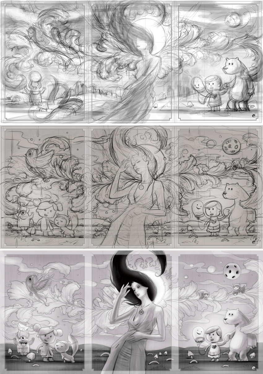
The next stages where really refining what i had scribbled down and starting to give a sense of shape with hints of color roughly washed in, more detail was added, the background characters shaped up and the girls pose changed. Her hair was roughed in to see how the shape contrasted with the other lines and the frame was ghosted in to give a better idea of the images as separate cards.
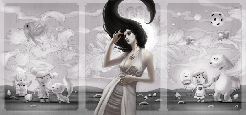
Onto the final painting- the original sketches above were scaled up to 450dpi and dropped in as a flat base layer so final painting could begin. The girl was painted almost completely in painter with my favorite oil brushes then the hair and dress were finished off in photoshop.
Additional elements were painted on separate layers such as the grass, clouds / smoke etc with the painted background being combinations of scanned watercolor and ink and some photoshop channel effects.
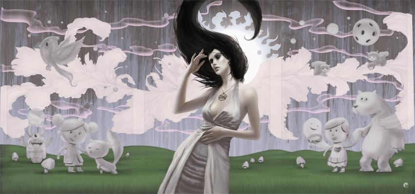
The characters are started and fleshed out together with some other midground elements and more refinements along the way..
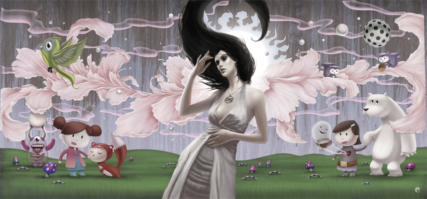
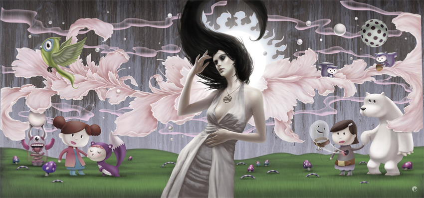
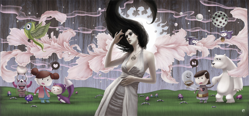
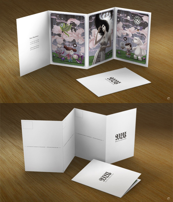
Finally the color corrected and tweaked image is done and the frame placed over the top. Each panel was then output for print and indesign used to set up the rest of the card. The cards themselves were digitally printed on an HP indigo on heavy weight stock, you may be able to see that the cards can be cut to seperate the panels as individual postcards or kept as a small book. These have now gone on their merry way to the desks of creative directors and buyers all over the world- hopefully putting a smile on the faces of the recipients!
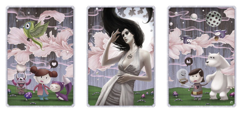
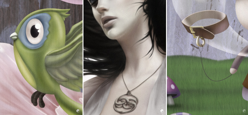
Finally, here's a few close-ups at 50% original size.

5 comments:
you are a crack
:D greetings from Barcelona
very nice! congrats
Wow! That is some amazing work!
Very nice. Her pendant looks like the one from the move Never Ending Story. I think it's called an auryn. Is that right? Anyhow, you've got some really great illustrations here.
incredible work. i love your works. do you always work with artrage and photoshop? this especially how do you have make that?
Post a Comment