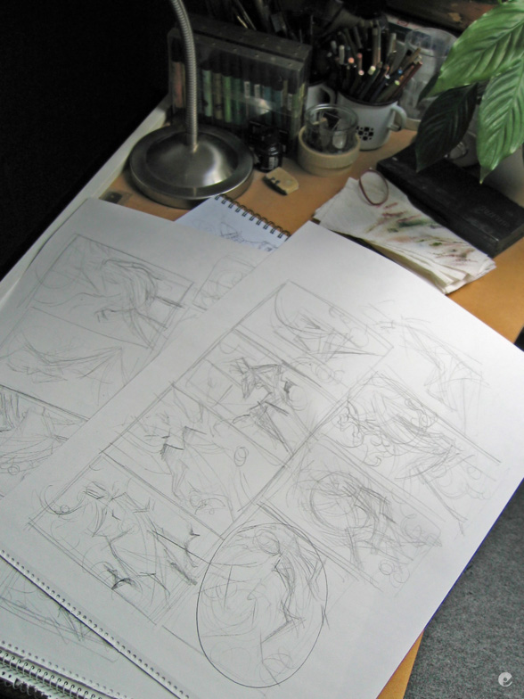
Next up is a shot of just how rough my thumbnails are for starting on a project like this..
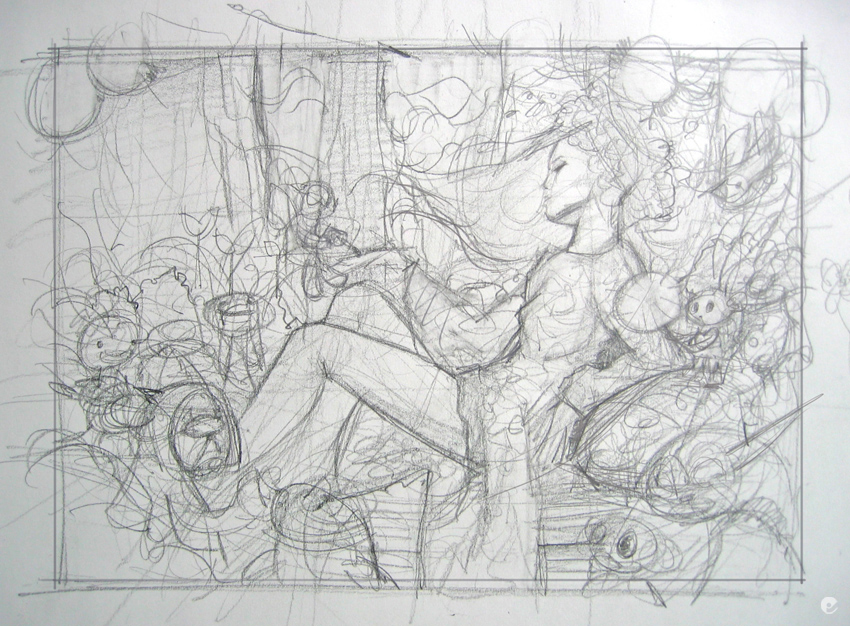
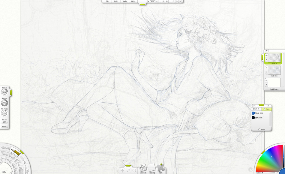
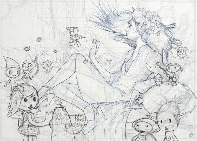
Next up is a better sketch, again- pencil and paper, this was then photographed and transfered to the machine where i used it as a base in artrage to develop a working drawing. the characters where then sketched out with bigger brushes in photoshop.
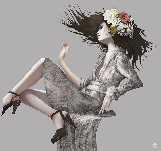
This is a shot to show how i tend to build up the image, sections painted and developed then clipped out with vector paths and painted layer masks. Its a time consuming way to do it but it does allow me lots of flexibility in the long run. (most of the time!)
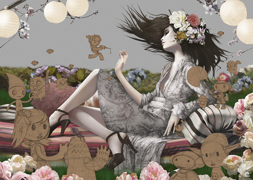
After blocking in the foliage background how i originally intended, it became clear it just wasnt going to work and a change of plan was needed.
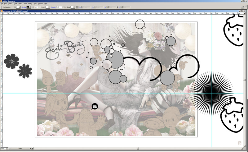
An illustrator grab showing some of the bits used in the final image..
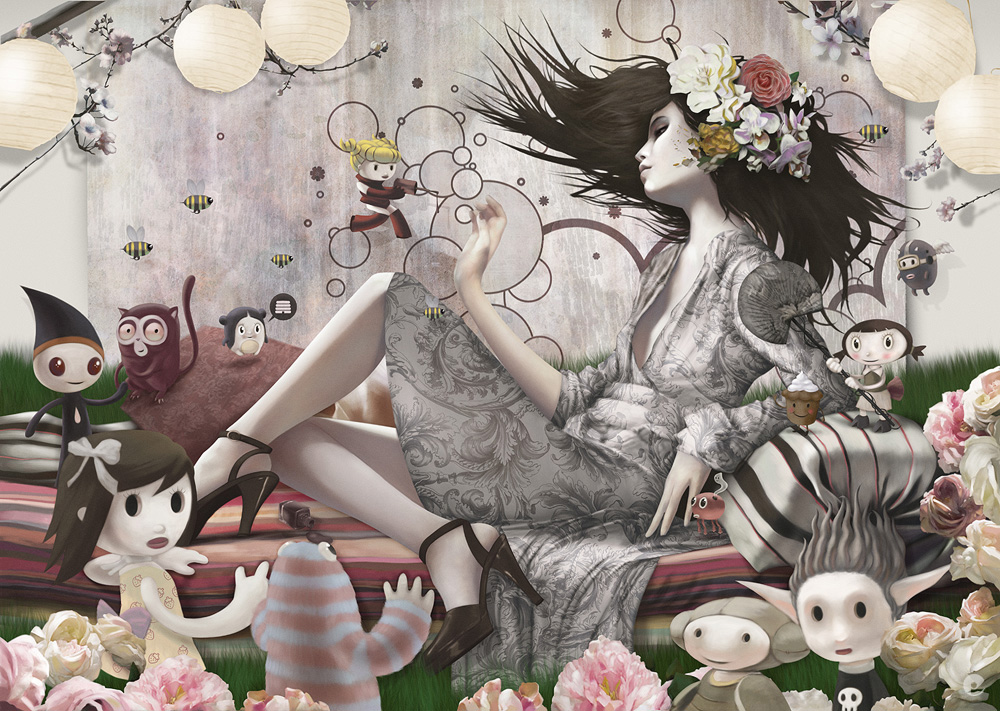
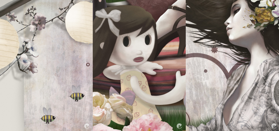
And thats basically it- remember to look out for the computer arts magazine for a more indepth explanation of this piece, im sure i will post a reminder when its out in the stands. I will leave you with a few closer shots of the final pic.

10 comments:
This is a wonderful work. really taken care of and imaginative.
Aplause!
wow! your work is lovable, amazing!
Your work is amazing!
Love your work.
what program are you working in - in this screen capture ? http://www.mostlywanted.com/Blogger/ersatzBeauty4.jpg ?
It looks awfully neat ;-)but its not something I recognize - which I'm guessing has something to do with me being a PC person ;-)
Thanks all,
mette- thats a screengrab of the working drawing in artrage 2.5, google the name and you can find the app online to buy- its low cost and a good sketching tool. I work on 2 monitors at hi res so i cant post a screen grab without reducing the size a bit in photoshop first! hope that helps.
Thank you so much Tom ;-)
am blown away by your magnificent work. very inspiring.
Thanks for the work through. It's great to see your process.
What do you like about Artrage? Besides the natural media modelling aspects, does it offer something that you don't get in Photoshop? Do you ever reverse the order of how you work, putting Photoshop ahead of Artrage and if so, under what conditions does that workflow decision make sense?
Beatiful work!
Cheers nate,
i prefer artrage primarily for the initial sketching processes, i dont usually use it for full works as painter offers better tools and control. What i really like about artrage is its simplicity- just the pencil and paintbrush are pretty much all i use, the added layer controls are a plus since version 2- its such a small app that its stable and quick to boot as well.
Artrage isnt really a mainstay in my workflow though- sometimes i will just sketch straight in photoshop- it really just depends on what im working on. Really the only times ive used artrage other than at a sketching phase has been to add texture to a piece- i generally use painter but on some occasions the smaller app actually gets the upper hand!
(another nice thing about artrage for initial sketching work is the reference images that you can pin to the work area- stupidly gimmick but i does come in handy!- check out ambient design.com if youre interested in more about artrage.)
Hi Tom, I picked up this magazine just the other week and your article was my favorite in the lot.
I look to other artists to see how I can improve my own work and you have been added to my slow growing list of illustrators that inspire me.
Post a Comment