Monday, 26 May 2008

Ersatz Beauty

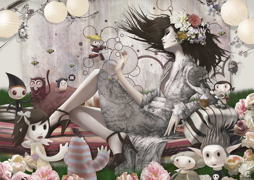
Here's a new painting that was for an up-coming issue of Computer Arts (issue 151 i think), its a little feature on my creative process and hopefully my gibbering words have been corrected into a cohesive article! What follows is probably very similar to the feature but as usual- you can see it here first! Here is the final dps image- the original is 300dpi at A3..


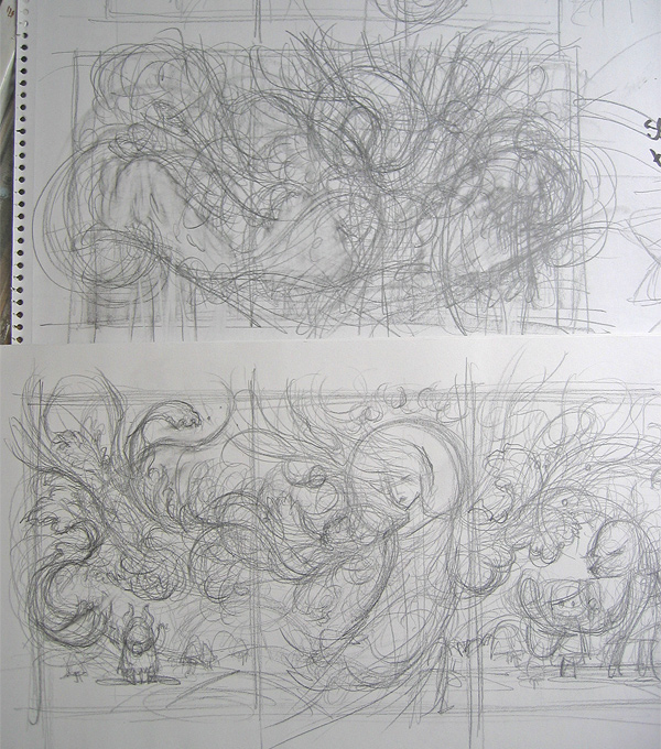
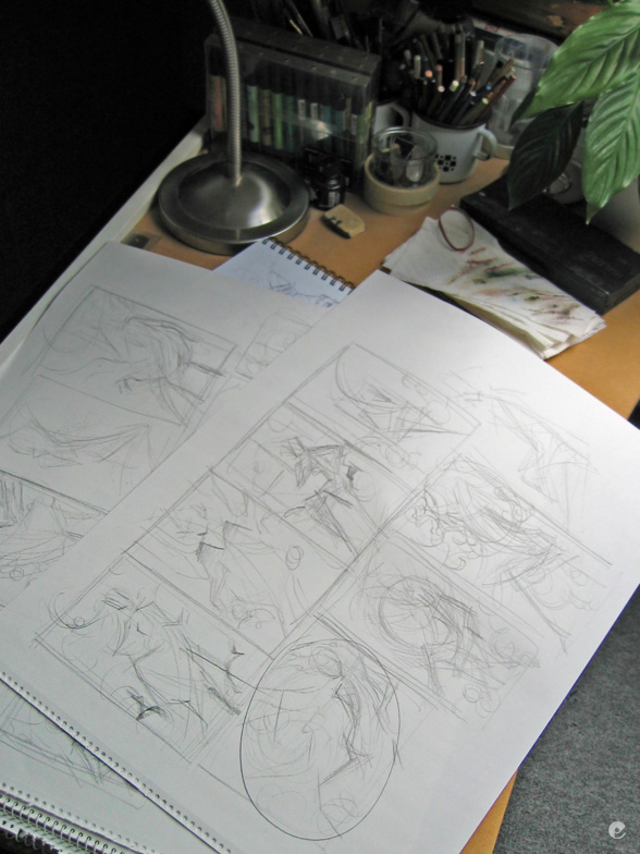
Next up is a shot of just how rough my thumbnails are for starting on a project like this..


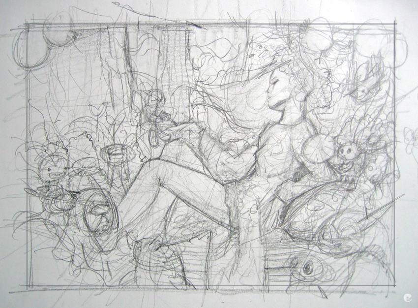
Next up is a better sketch, again- pencil and paper, this was then photographed and transfered to the machine where i used it as a base in artrage to develop a working drawing. the characters where then sketched out with bigger brushes in photoshop.
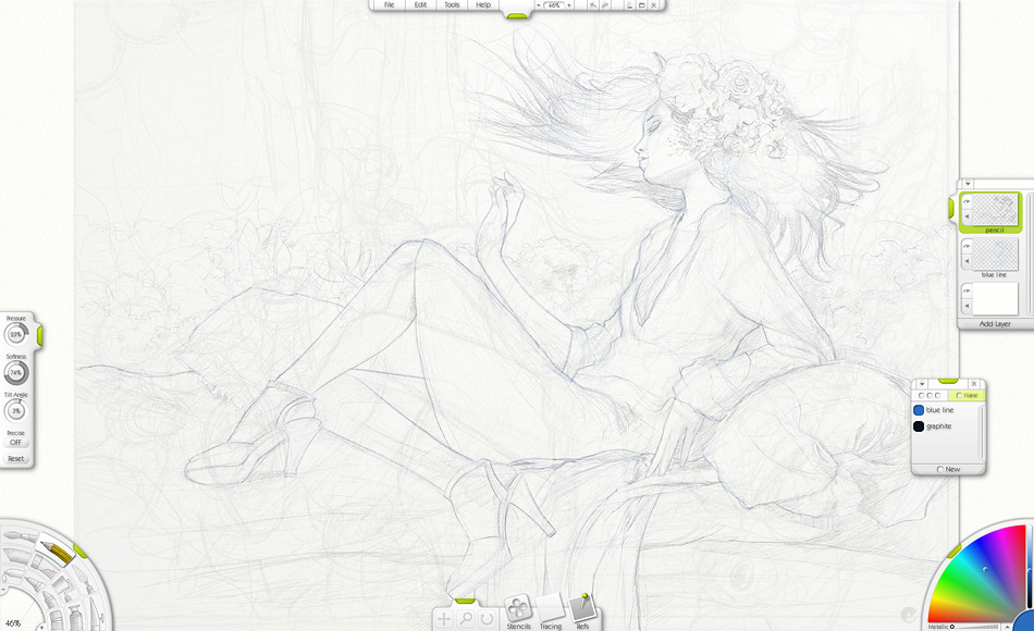
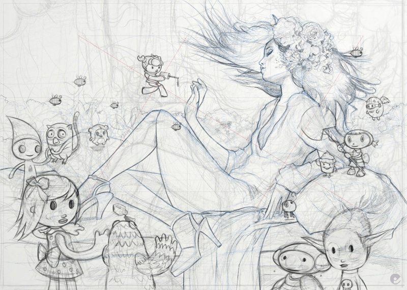


This is a shot to show how i tend to build up the image, sections painted and developed then clipped out with vector paths and painted layer masks. Its a time consuming way to do it but it does allow me lots of flexibility in the long run. (most of the time!)
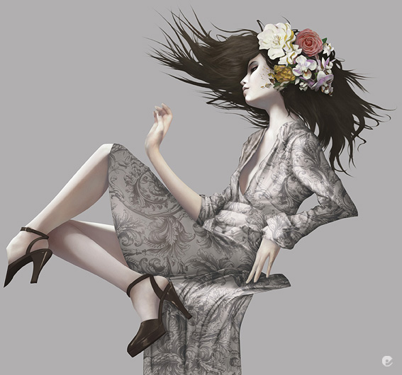


After blocking in the foliage background how i originally intended, it became clear it just wasnt going to work and a change of plan was needed.
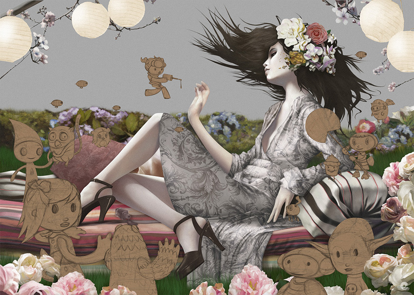


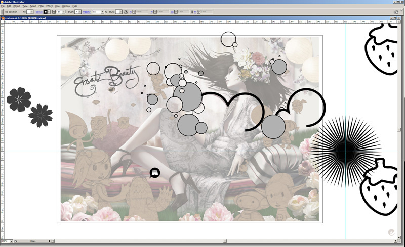
An illustrator grab showing some of the bits used in the final image..


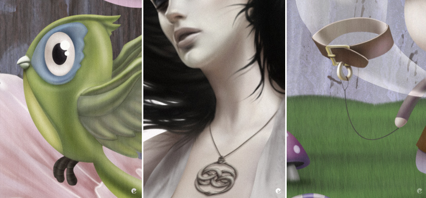
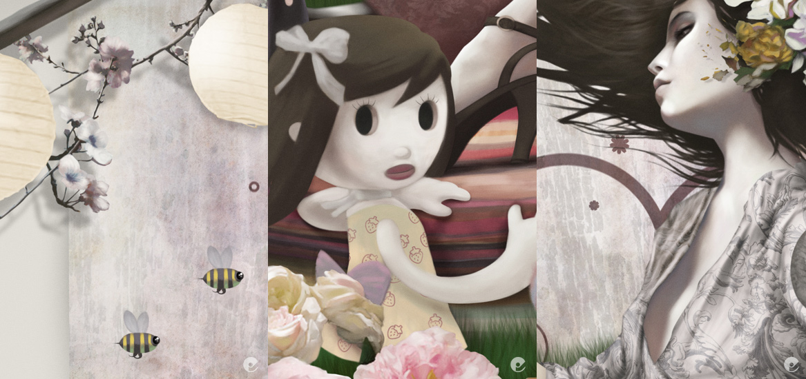
And thats basically it- remember to look out for the computer arts magazine for a more indepth explanation of this piece, im sure i will post a reminder when its out in the stands. I will leave you with a few closer shots of the final pic.
Finally- an update!

Sorry about the lack of recent updates, this is mainly down to lots of family fun, getting used to a baby can take awhile and certainly has its ups and downs, fortunately we seem to be over a tricky patch so hopefully things will run a little smoother. Ive also been working inhouse pimping my design services to various agencies, thats also been sucking up quite a bit of time- but im a bit more freed up now so with any luck i will be able to post some updates.

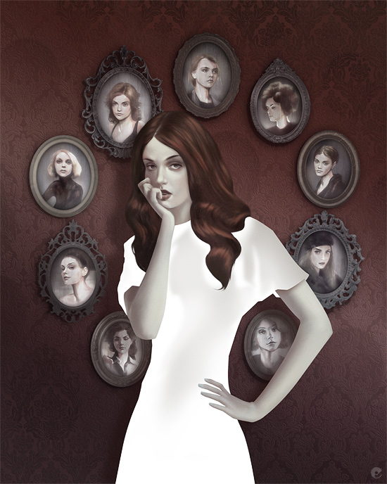
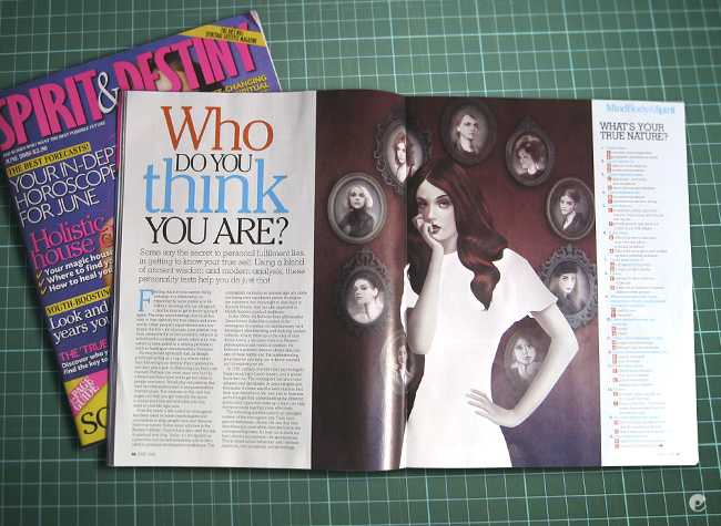
To kick things off, here's a recent illustration for Spirit and Destiny magazine, the article was entitled 'who do you think you are?' and was a quiz type thing to discover your personality type. The brief was quite specific and after worrying about some of the technicalities is was able to get it done within deadline.


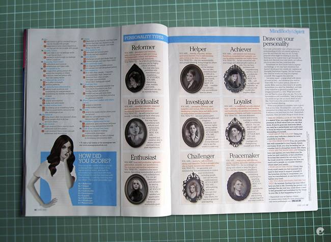
Heres a couple of magazine shots to show the spread and what was done for the article:


Sunday, 30 March 2008

New prints


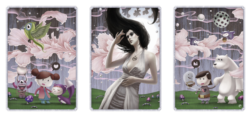
The Candy Fantasy triptych painting has now been made available to buy as three 7.5″ x 11″ archival giclee prints on heavy, acid-free fine art paper. 'Candy Fantasy 1-3' is only available through BlueFlip Art.
Grab yourself a copy! Candy Fantasy Triptych prints on BlueFlip art.

Have a look at the creation process in the previous posting: Promotional mailout illustration.

Saturday, 22 March 2008

Bit of a break...

Once again a big gap in my posting, but with very good reason- i have been enjoying the arrival of my baby daughter erin- who has been keeping me exhausted but stupidly happy! When things settle down a bit i should be able to get around to getting some new work out and posting a bit more.

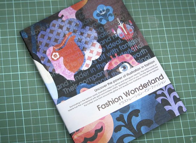
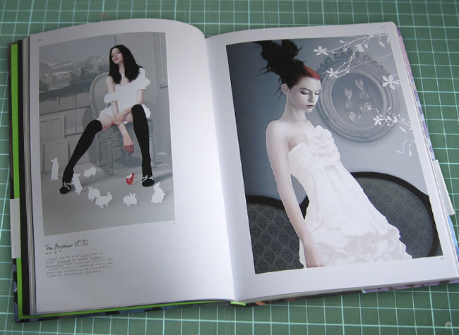
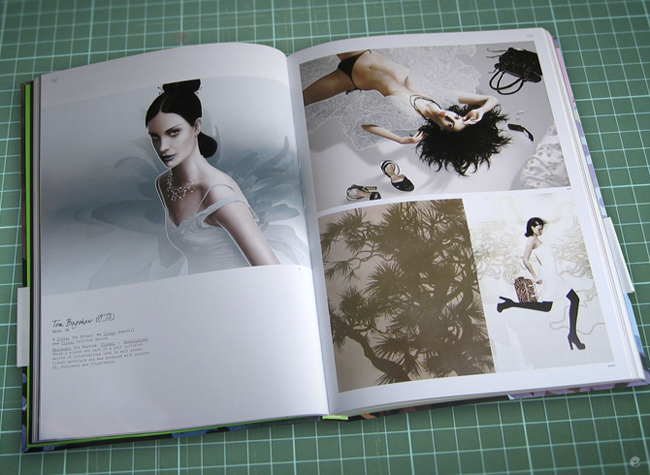
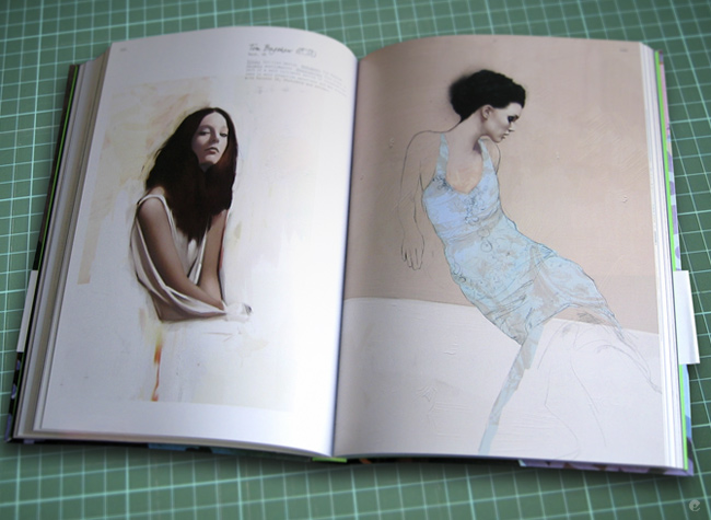
I have just received Victionaries latest book 'Fashion wonderland' for which i contributed some works. Fantastic book- buy it if you can, they tend to go pretty quick. Link to the Victionary site. Im also in the latest edition of Imagine Publishing's 'Photoshop creative' mag (issue 33) with a few tips and some pieces of work included in the digital painting feature. I will leave you with a look at the spreads for the fashion wonderland book. Back soon.


Monday, 3 March 2008

Promotional mailout illustration

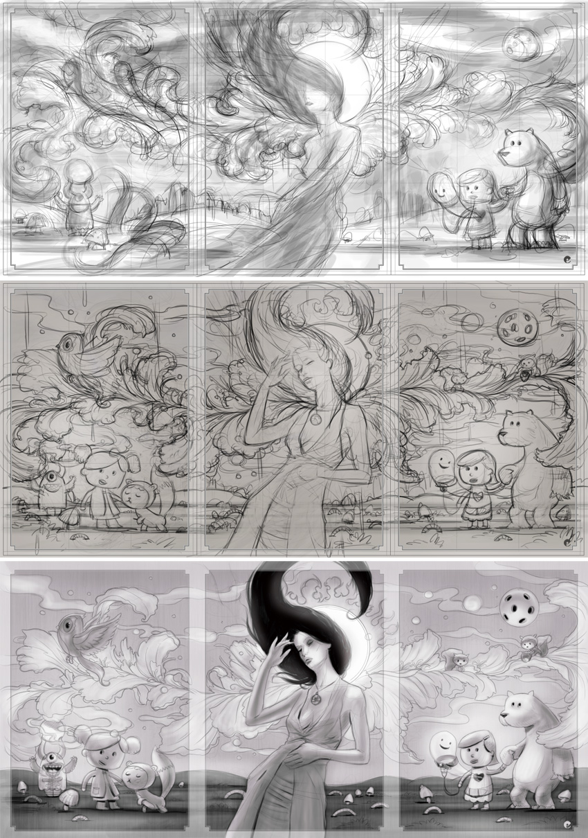
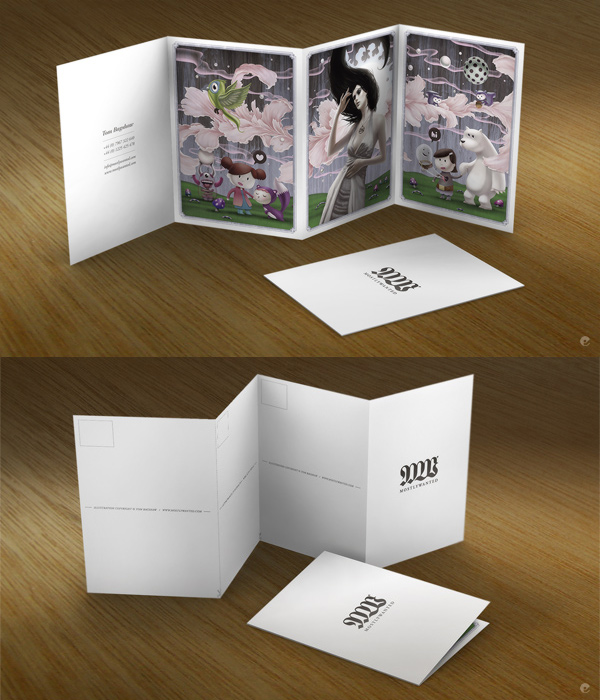
As i mentioned in a previous post, here is a look at the new mostlywanted mailer and a few process shots. As you can see, the initial sketch was little more than a few scribbles, really just defining the general shapes and the flow around the image area. I had already decided that the illustration would be framed as a triptych so that was taken into account during the early stages.


The next stages where really refining what i had scribbled down and starting to give a sense of shape with hints of color roughly washed in, more detail was added, the background characters shaped up and the girls pose changed. Her hair was roughed in to see how the shape contrasted with the other lines and the frame was ghosted in to give a better idea of the images as separate cards.


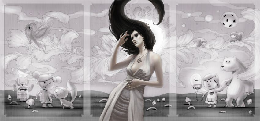
Onto the final painting- the original sketches above were scaled up to 450dpi and dropped in as a flat base layer so final painting could begin. The girl was painted almost completely in painter with my favorite oil brushes then the hair and dress were finished off in photoshop.


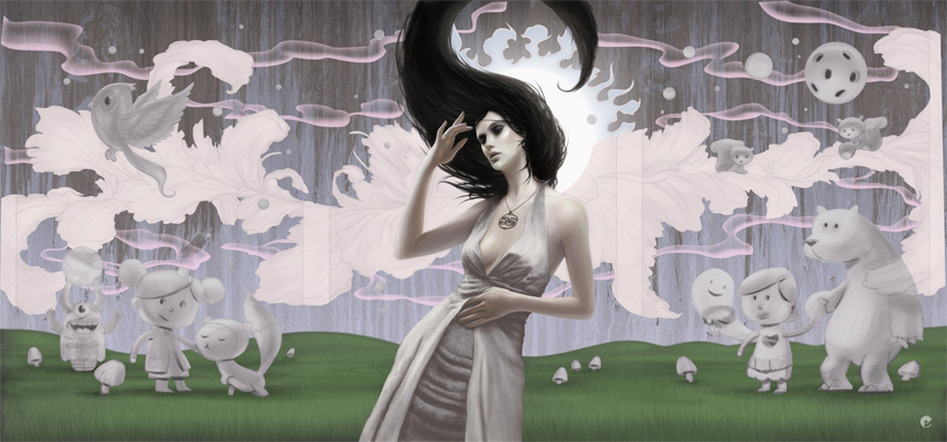
Additional elements were painted on separate layers such as the grass, clouds / smoke etc with the painted background being combinations of scanned watercolor and ink and some photoshop channel effects.


The characters are started and fleshed out together with some other midground elements and more refinements along the way..


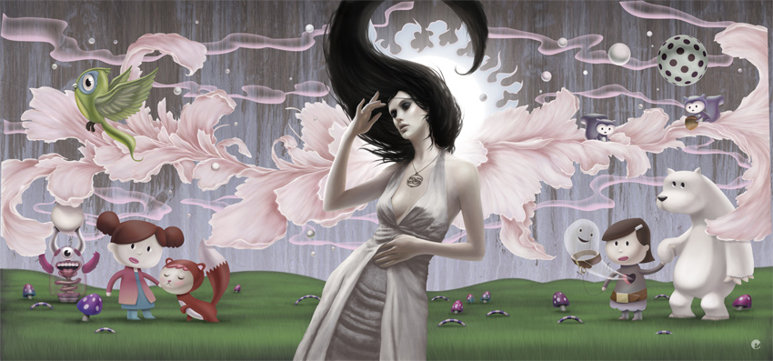
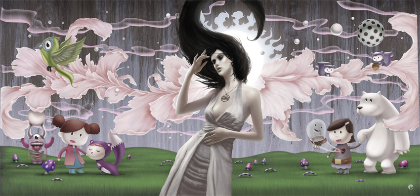
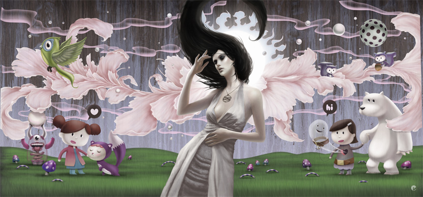
Finally the color corrected and tweaked image is done and the frame placed over the top. Each panel was then output for print and indesign used to set up the rest of the card. The cards themselves were digitally printed on an HP indigo on heavy weight stock, you may be able to see that the cards can be cut to seperate the panels as individual postcards or kept as a small book. These have now gone on their merry way to the desks of creative directors and buyers all over the world- hopefully putting a smile on the faces of the recipients!


Finally, here's a few close-ups at 50% original size.